Contrast
The global tonal spread of the delivered photograph, how far apart its darkest and brightest tones sit, read as a mood register, not a more-is-better axis.
FinalFrame pontua cada foto de 0 a 10: um 6 é competente, um 8 é digno de portfólio e um 9 é de nível de exposição. Como funciona a pontuação
O que é de verdade
Contrast is the most spoken word in photographic feedback and the least defined. Punchy, flat, harsh, muddy, matte, graphic: all contrast words, reached for daily, and almost nobody reaching says which of several different things they mean. So this page has two jobs. It teaches the thing itself, and it draws the borders, because in this curriculum contrast has four neighbors that each own a piece of the tonal territory, and a photographer who confuses them walks to the wrong fix.
The thing itself: contrast is the global tonal spread of the delivered photograph (how far apart the frame's darkest and brightest tones sit, and how the tones between them distribute across that distance). A compressed spread reads low-contrast: matte, soft, quiet, foggy. A wide spread reads high-contrast: punchy, graphic, hard. Notice that every one of those words names a mood, not a grade, and that is the load-bearing fact of the whole lesson. Contrast is a register, the way a sentence has a tone of voice. The most damaging folklore in tonal editing is the belief that it is a quality axis with "more" at the good end. It is not an amount to maximize. It is a choice to make, and the choosing, not the quantity, is what a strong frame can be caught doing.
Now the borders, each neighbor by name. Dynamic range is the span the sensor captured: a container, fixed forever at the shutter. Contrast is what the photograph does with the captured span: a file can hold a wide range delivered quiet and compressed, or a narrow range spread across the full scale. The capture is the budget; contrast is the spend. Tonal hierarchy is an order, not a span, which mass in the frame wins the eye, which comes second; that lesson says it plainly, and it bears repeating from this side of the border: a frame can own a full histogram, true blacks, crisp whites (maximum contrast by every global measure) and still have no ranking at all, six patches shouting at the same volume. Raising contrast raises the volume of the argument; it never decides who wins it. Midtones is the middle band's own internal separation: contrast at the scale of the subject's material, where the muddy middle lives; a frame's global spread can be perfect while the face inside it stays a flat mask, because the ends of the scale were set and the tones between them never separated. And the tone curve is the instrument: the machine that executes whatever spread this page decides. Its grammar (slope is contrast; the placed S; the fade) lives on its own page; this one owns the decision the instrument exists to serve.
One distinction remains inside the territory itself. Global contrast is the full-scale spread: black point to white point, the whole frame in one move. Local contrast is the same idea at neighborhood scale: how strongly a tone separates from the tones directly beside it, the province of Clarity-class tools, and mostly the midtones lesson's band. Hold the family apart with one sentence each: dynamic range is what the file holds, contrast is what the picture shows, hierarchy is who wins, midtones is the middle's own separation, and the curve is how.
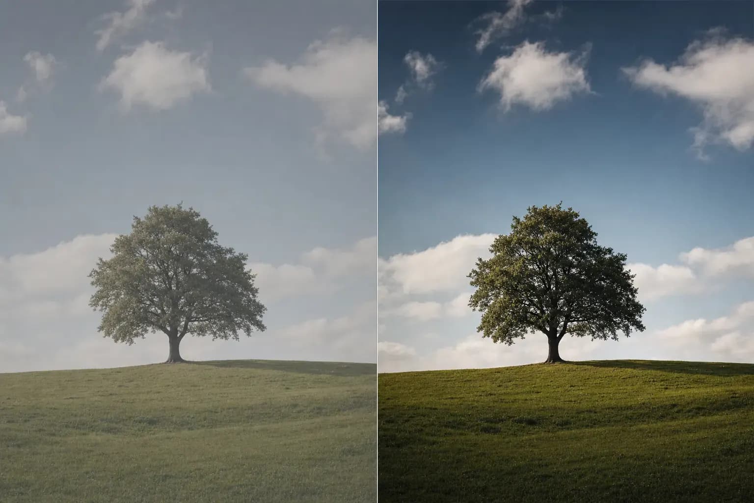
Gerada por IA
Por que um 6 não é um 8
The 6 treats contrast as an amount, and the amount has a default direction: up. It wears one of two faces, and both look like nobody chose. The common face is the cranked frame: the make-it-pop reflex, run to completion. The frame looked flat, something got pushed until it snapped, and the pop was accepted as the finish line. Look at the invoice: blacks crushed into a solid mass, brights gone hard and chalky, colors suddenly louder than anyone asked them to be, and the same spread on the last forty frames in the catalog, because the push was a habit, not a reading of this picture. The quieter face is the undecided frame: no true black, no clean bright, the spread never set at all (the frame ships at whatever contrast the scene and the default render happened to produce, grey weather even when the light wasn't). Opposite amounts, identical diagnosis: the register was inherited, not chosen.
The 8 chooses a register and can defend it out loud. A low-contrast 8 exists: the fog held as fog; the quiet portrait whose compressed, matte calm is the mood, its floor raised on purpose and consistent through the frame. A high-contrast 8 exists: the graphic shadow-play that spends both ends knowingly and keeps texture exactly where it promised to. Here is the tell from the judging chair: name the frame's contrast in one word, then ask whom the word describes. In an 8, the word describes the subject (quiet, hard, tender, severe) because the spread is the mood's delivery system. In a 6, the word describes the processing (punchy, crunchy, flat) because the spread is a setting the frame happened to receive. The amount never separates the scores. The match does.
Antes do disparo
The scene has a contrast before you do, and the light writes it. A small, hard source writes high inherent contrast: deep shadows, bright planes, short transitions between them. An overcast sky or open shade writes low: every tone arriving close to its neighbors. Read it the way the light-quality lesson reads everything, off the shadows: knife-edged and dark-cored means the scene is already wide; dissolved and pale means it is narrow. Then ask the register question before the meter question: what spread does this picture want? Fog photographed as fog is not a problem awaiting a slider. A storm-lit street is not asking to be gentled. Squint, feel where the scene's tonal mass sits, and decide whether the picture in front of you is a quiet one or a loud one, because that decision, made now, chooses the light you accept and the exposure you protect.
At the screen, the histogram states the spread at a glance: width and wall contact. A mound bunched in the middle, touching neither wall, is a narrow frame: raw material if that's clean capture awaiting a decision, a failure only if it ships undecided. Mass reaching both walls is a wide frame already spending its ends: the full read, including what the ends are hiding, belongs to the histogram lesson.
And one warning about your own eye, because contrast is where it lies most: in an instant A/B, the contrastier version always wins. Punch reads as improvement in a two-second flip, which is precisely the mechanism by which the cranked 6 gets approved by its own author, one confident comparison at a time. Defeat the reflex the way the edit-discipline lesson teaches: walk away, return cold, and ask the one-word question (does this spread describe the subject, or the session)?
Na câmera
Contrast is born at capture, and the parent is light. The full craft of choosing and shaping that light (source size, direction, the hour, the scrim, the orbit) is the light-quality lesson's; what belongs here is the ratio itself and one law about which direction it bends later. Fill closes the spread: a reflector, a bright wall, a cloud crossing the sun, and the scene's darks lift toward its lights. Removing fill opens it. Those two moves, at the scene, set the inherent contrast every later decision inherits.
The law is an asymmetry, and it is worth owning before it costs a frame: spread is easy to add to a clean capture and expensive to subtract from a hard one. A flat, evenly-lit file with clean, unclipped data steepens beautifully at the desk: bunched-but-clean is raw material, and the widened result reads native. Run it the other way and the file fights back. The global spread of a hard-light capture will compress on command, but the light's signature does not un-write: the shadow edges stay knife-hard inside the new quiet, the shadows you lift bring their noise up with them, and the frame drifts toward that grey, tone-mapped glow that announces processing from across the room. So: when the register is decided, shoot in the light that writes it (a genuinely hard-lit frame carries a thousand agreeing witnesses, in every shadow edge and glint, that no global move fakes). When the register is undecided, err toward the softer, cleaner capture, and keep the decision alive for the desk.
Either way, protect the ends you intend to use. A spread is drawn between tones that must exist to be spread: a shadow you plan to keep as texture needs generous exposure now, a highlight you plan to keep as texture must not clip now. Where the key tone sits is the exposure lesson's question; whether the whole span fits is dynamic range's. Answer both with tomorrow's register in mind.
Na edição
The tools, in the order a disciplined session meets them. Black and white points first: the anchors. They set the frame's floor and ceiling and stretch the span between them, and this single move rescues the undecided frame: a placed true black and a controlled bright hand the picture structure it was shipping without. Then the spread's shape. The contrast slider is one fixed bend at one address: an amount, applied to the middle whether or not the picture lives there. The tone curve is the allocation: steepness placed on the band where the subject's tones actually sit, the ends eased or spent on purpose. The grammar is the tone-curve lesson's; the short version is its law: slope is contrast, and with the endpoints anchored, steepening one region always flattens another. And run the law in reverse to see that low contrast is a deliverable, not a defect: the raised black point is the matte fade, the flattened middle is calm (decisions, when they are decisions).
Know what global contrast cannot do, because both walls hand off by name. It moves every pixel of a given brightness identically, the subject and the same-toned wall behind it rise and fall in the same stroke, so it cannot build a ranking; when the finding is "the subject must win," the plan is tonal hierarchy and the hands are dodge-and-burn and masking. And its reach into the middle band is only as fine as a curve's placement; when the subject's own tones are muddy inside a correct global spread, the job is the midtones lesson's: a targeted steepening plus Clarity-class local contrast in measured doses.
Now the costs of the crank, because every one of them is a border crossing. Push the spread past the ends and the ends clip: crushed blacks and blown whites are not a style when they arrive as a side-effect (they are destroyed data, and in an export with no original behind it, destroyed permanently). Contrast added through the composite curve drags saturation up with it: when the palette starts shouting after a tonal move, that is the mechanism, not the monitor. And local contrast pushed for punch mints halos at every high-contrast edge and grit on every surface: at which point the frame's problem has a new name, and the edit-discipline lesson is already describing it.
The honesty clause: global contrast redistributes tones that exist; it cannot widen a span the capture never held. Two walls, both hard. An end clipped at capture holds nothing to spread: pulling a blown white down makes grey, not cloud; that boundary belongs to highlight recovery, and no curve crosses it. And the genuinely narrow capture (the flat-light, grey-day file) stretches only so far before the seams show: a handful of recorded levels pulled apart until the gaps between them band, shadows amplified into noise before they yield detail. When the picture needed a wide spread and the light never wrote one, forcing it manufactures artifacts, not drama. That frame is capture-limited: the contrast it lacks was available at the scene, for the price of different light, and it is not for sale at the desk.
A escada
- Beginner: contrast as an amount. One slider, one direction, every frame; pop is the goal and the finish line; the ends are never inspected, and "more" is standing in for "better."
- Competent: anchored but uniform. Black and white points set, the worst clipping avoided, a gentle default spread applied by habit. The frames stop failing and start matching: a house register, worn by every picture whether it fits or not.
- Strong (the working level of a serious amateur): matches spread to subject. Reads the scene's inherent contrast off the light before the shutter and the file's off the histogram at the desk; chooses the register per picture; knows which neighbor owns which job (the span to dynamic range, the order to tonal hierarchy, the middle band to midtones) and reaches for the curve, not the slider, when the move needs an address.
- Advanced: contrast as voice. Runs low as confidently as high; sets the spread with light at capture and allocation at the desk; spends an end only on purpose; and delivers frames where a viewer can name the mood but never the move.
Vá fotografar
One small subject with form and a little texture: a crumpled paper bag, a weathered post, a face if one is willing. Shoot it twice with the same framing: once in soft light (open shade, overcast, a curtained window) and once in hard light (direct sun, a bare lamp in a dim room). Two captures; the light is the only capture variable, because the light is where contrast is born.
At the desk, build four versions: each capture developed to each register. Soft-quiet: anchor it honestly (a true floor, a controlled ceiling) and keep the spread gentle, letting the softness be the mood. Soft-wide: spread it on purpose (a placed curve, steepness on the subject's band, ends protected). Hard-wide: the light's own register, developed with restraint (this file barely needs a hand). Hard-quiet: compress the hard file toward calm (brights pulled down, shadows lifted) chasing the matte quiet the soft capture was born with.
Read the grid like a judge, in two passes. First the asymmetry, because it is the lesson: soft-wide works (clean, bunched data spreads honestly, and the widened frame reads native). Hard-quiet fights: the global spread compresses, but the shadow edges stay hard inside the new calm, the lifted shadows carry noise up with them, and the frame drifts toward the grey glow that says processed before it says anything else. You have now watched contrast travel both directions and met the law directly: easy to add to a clean capture, expensive to subtract from a hard one. Second, the match: rank all four not by punch but by service (which register serves this subject's mood) and catch your own eye reaching for the punchiest tile on the quick flip. Walk away. Return cold. Rank again. The re-ranking is the trained eye arriving.
Then close the loop, and know where to look for the verdict, because contrast is not a bottleneck category of its own; it surfaces in a critique under its neighbors' names. A spread pushed past the ends surfaces as exposure (crushed blacks and blown highlights are that finding's own vocabulary) or as edit-discipline when the manufacture shows. A spread never decided (the anchorless, flat-shipping frame) surfaces as tonal hierarchy, because an undecided spread leaves nothing ranked for the eye to obey. So take the version that serves the subject and re-critique it. If the register was the missing decision, the named bottleneck should move, and the FinalFrame Score has room to move with it. And if the same bottleneck is named again, that is information, not indictment, and it reads one of two ways. Either the finding was local and the move was global: the ranking still doesn't favor the subject, or the subject's own band is still muddy, and the fix lives one lesson over (tonal hierarchy or midtones, executed through dodge-and-burn and masks, not another global push). Or the register was right and the file couldn't fund it: an end already clipped, a span the light never wrote (capture-limited, and the honest fix is standing in better light, not standing longer at the desk). Both answers cost two captures and four versions to own. The score is not the reward: the moved bottleneck is.
Lições relacionadas
Veja na sua própria foto
A forma mais rápida de entender a pontuação é ler uma sobre uma foto que você conhece bem.
Criticar uma foto