Tone curve
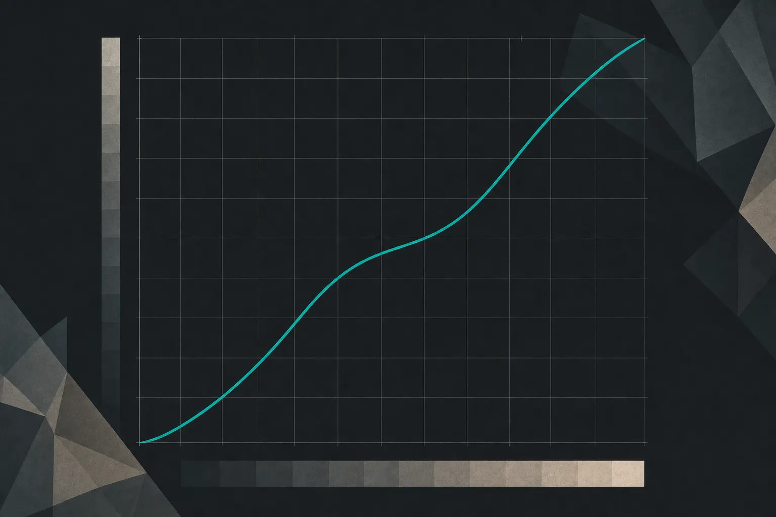
The graph mapping every input brightness to an output brightness: deciding where in the tonal range contrast is spent.
FinalFrame हर फ़ोटो को 0–10 पर स्कोर करता है: 6 सक्षम है, 8 पोर्टफ़ोलियो-योग्य है, और 9 प्रदर्शनी स्तर का है। स्कोरिंग कैसे काम करती है
यह असल में क्या है
The tone curve is a contract between the photograph you captured and the photograph you deliver, drawn as a single line. The horizontal axis is input: the brightness every tone had when the file arrived, shadows at the left, highlights at the right. The vertical axis is output: the brightness each of those tones gets. Untouched, the curve is a straight diagonal: every tone maps to itself, and the contract says "no changes." Every edit you make with it is an amendment. Raise a section of the line and the tones living at that input brighten; lower it and they darken. That is the entire mechanism, and it is worth sitting with, because everything else the tool does follows from it.
Here is the idea that turns the graph from intimidating to legible: slope is contrast. Where the line runs steeper than the diagonal, the tones passing through it are pushed further apart: small input differences become larger output differences, and that widening is what contrast is. Where the line runs flatter, tones bunch together and differences compress. A curve is not a brightness tool with a strange interface; it is a machine for deciding where in the tonal range contrast is spent and where it is withdrawn.
Once you can read slope, you discover you have been using curves all along without being told. The contrast slider is a curve: a fixed symmetric bend around the middle, with strength as the only choice you are given. Levels is a curve with three handles. A film-emulation preset is, more than anything else, a curve someone else drew. The curve panel is where the disguises come off: every tonal move any editor makes can be drawn on this one graph, which means learning to read it makes every tonal edit, yours or a preset's, stop being a mystery.
You steer it with anchor points. Click the line and drag: the curve bends through your point and eases smoothly between points. The horizontal position of a point selects WHICH tones you are addressing; the vertical drag decides what happens to them, so the working habit is to grab the line at the brightness of the thing you care about and move that. A point left sitting on the diagonal does the opposite job: it pins its neighborhood in place, protecting a region from moves you make elsewhere.
The neighbors draw this lesson's borders. Exposure decides where the scene's tones land in the file. Dynamic range decides whether they fit. Midtones diagnoses one specific band's internal separation. The tone curve is the instrument all of them reach for at the desk, and this page is about the instrument itself: its grammar, its moves, and its price.
6 क्यों 8 नहीं
A 6 buys its contrast with the slider; an 8 allocates it with the curve. The 6 is easy to reconstruct: the frame looked flat, the contrast slider went up until it "popped," and the pop arrived with its usual invoice (blacks crushed toward a solid mass, bright areas gone hard and chalky, colors suddenly louder than anyone asked them to be). The slider's bend is welded to the middle of the range and applies everywhere at once, so the punch lands on the subject and the clutter with perfect impartiality, and the ends of the scale pay for a middle that may not even be where the picture lives. The frame reads as processed from across the room, not because contrast is wrong, but because it was purchased in bulk.
An 8 has the same appetite for contrast and spends it like a budget. The steep section of the curve is placed through the band where the subject's own tones sit, so the separation arrives exactly where the picture needs it. The ends are protected on purpose: the shadow toe eased so the darks keep breath, the highlight shoulder rolled so the brights keep texture. The judge's tell is to look at the extremes, not the middle. In the slider frame, the ends paid without being consulted: hollow blacks, blank whites. In the curve frame, whatever the ends gave up was part of the deal, and you can feel a hand weighing the trade. Contrast in a 6 is an amount. Contrast in an 8 is an allocation, and the allocation, not the quantity, is what separates the scores.
शटर से पहले
For an editing tool, seeing means previsualizing the shape you will draw later, and it starts at the scene, as a reading of tones. Look at the light and ask what distribution it is writing: fog and flat overcast bunch everything into the middle of the scale (a frame that will want steepening); hard sun loads both ends: a frame whose curve work will be taming and rolling, not adding. You are learning to see the histogram before it exists, and with it the curve the frame will ask for.
Then name the band that matters. Where do the subject's tones actually live: up in the brights, like snow, pale fabric, lit skin? Down in the darks, like weathered wood, deep interiors, a low-key figure? In the middle, like most of everything else? That band is where the slope will go at the desk, which makes it the band to protect at capture, and it is the question the contrast slider never asks.
At the screen, read before you drag. Most editors draw the histogram behind the curve: the mountains show you where the frame's tones are massed, so you can see at a glance which stretch of the line actually has tones living under it (a steep segment over empty histogram moves nothing). Many editors will also show you where a spot in the image sits on the curve when you hover or click it; use that to find the subject's band precisely instead of guessing. And practice the literacy this lesson is really for: when a preset or a borrowed look lands on your frame, open its curve and read the shape (the lifted black end, the rolled shoulder, the steep middle). If you can read the line, you know what a look will do before it does it.
कैमरे में
Expose for the curve you plan to draw, because every move you will make at the desk has a data cost that is paid at capture. Two rules cover most of it. A shadow you intend to lift needs generous exposure now: steepening the dark end of the curve amplifies whatever lives there, and in a starved shadow, noise arrives before detail does. A highlight you intend to roll needs to be unclipped now: a shoulder can only roll data that exists, and a blown white gives it nothing to bend. The placement mechanics belong to the exposure lesson and the fitting problem to dynamic range: what belongs here is the habit of shooting with tomorrow's curve in mind.
Shoot RAW, so the curve works the widest material the sensor recorded rather than a range already folded down and baked. And do not fear the flat scene: a bunched histogram with clean, unclipped data steepens beautifully at the desk (flat light is often a gift to the curve, a full span of quiet tones waiting to be spread). The distinction that matters is bunched-but-clean versus bunched-and-clipped; the first is raw material, the second is a wall.
One boundary, echoed from the midtones lesson because it is cheap to learn here and expensive to learn later: a curve spreads tones that differ. It cannot write a difference across a form that flat, frontal light never modelled: if the lit side and shadow side of a face arrive at the same brightness, no steepness separates them, because to the curve they are the same input. Side light at capture is a curve no editor sells.
एडिटिंग में
This is the tool's home ground, so learn the moves as a vocabulary: each one is a shape on the graph, and each shape has a price printed on it.
The S-curve first, because it is the oldest move in tonal editing and the whole tool in miniature. Two points: one in the lower quarter of the line, dragged down; one in the upper quarter, dragged up. The segment between them, the midtones, steepens, and the middle of the frame gains separation and punch. Look at what paid for it: the toe below your lower point and the shoulder above your upper point have gone flatter, compressing the deep shadows and bright highlights. With the endpoints anchored, the curve's total span is fixed: steepening one region always flattens another. The S-curve does not create contrast; it moves contrast from the ends, where only punctuation lives, to the middle, where most subjects do. That trade is right for most photographs, which is why the gentle S is perpetual advice, and the depth of the S is exactly the size of the tax on the ends, which is why "gentle" is the operative word.
Then the move that separates curve users from slider users: place the S. Nothing says the steep segment must sit in the middle. Slide both points up the line and the steepness lands in the brights: where a snow scene or a pale dress actually lives. Slide them down and a low-key frame's darks open into separation while the rest stays quiet. This is the allocation the 6-to-8 gap turns on, and it is the thing the contrast slider is structurally unable to do: the slider owns one bend at one address; the curve lets you decide where contrast is spent.
Run the logic in reverse and you get the fade. Raise the black endpoint off the floor and the frame loses its true black: the matte, faded look, named and chosen, is exactly this and nothing more. Flatten the middle and the frame quiets toward calm. These are not errors; they are the same slope-is-contrast law running the other direction, and a photographer who can only add punch owns half the tool.
Levels versus Curves, since every editor offers both: Levels is three handles (a black point, a white point, and a midtone slider between them). It sets the span (and clips whatever falls past the points) and shifts the middle's overall brightness, applying one uniform stretch to everything: a blunt, honest tool for anchoring a faded frame. Curves does everything Levels does (the endpoints of the line ARE the black and white points) and then everything Levels cannot: arbitrary points, local slope, a steep segment placed on the subject's band while an anchor pins the rest. Levels answers "how wide, and how bright in the middle." Curves answers "where, exactly, and how much, exactly." When the job is more precise than the whole frame at once, the curve is the tool.
Anchor points are your protection clause. Before a bold move, click a point onto the part of the line you want left alone and leave it on the diagonal: lift the shadows with the highlights pinned and the brights hold still. This, plus a light hand, is what keeps curve work invisible.
Two side effects to know by name. Contrast added through the composite curve drags saturation up with it: as tones spread, colors get louder; if the palette starts shouting after a curve move, that is the mechanism, not your monitor. And each color channel has a curve of its own: raise or lower red, green, or blue individually and you are shifting color balance per tonal region (the blue channel pulled down in the highlights warms them, lifted in the shadows cools them, which is the machinery underneath split-toning and half the film looks in existence). Deliberate channel work is authorship and belongs to the color-grading lesson; channel work as surgery on a stubborn tint belongs to the color-cast lesson. Know that the mechanism lives here, and go there for the craft.
Now the honesty clause, and with this tool it is a matter of arithmetic. A curve is a map: every input value is sent to exactly one output value. A blown highlight is thousands of pixels all sharing the single input value at the top of the scale, so no curve can ever turn them back into cloud, because a map can only send one value to one place. Pull them down and they all arrive together: a flat, even grey where texture should be. A crushed black is the same wall at the other end. And short of the wall there is a tax: a steep segment stretched over thin data (deep shadows hauled up hard, a narrow band spread wide) hands back amplified noise and visible banding, a few recorded levels pulled apart until the gaps between them show. The curve shapes the latitude the capture banked; it cannot create latitude. When the data is not in the file, the missing piece belongs to dynamic range and highlight recovery, and the frame is capture-limited: the fix was at the meter, not on this graph.
One more boundary, because it is where this tool hands off: the curve is global. It moves every pixel of a given brightness identically: the subject and the same-toned wall behind it rise and fall together, which is precisely why a curve alone cannot build a ranking. When the finding is "the subject must win against its surround," the plan is the tonal-hierarchy lesson and the hands are dodge-and-burn and masking: a curve through a mask is exactly how much of that local work is done, and it is the bridge between this page and those.
सीढ़ी
- Beginner: one slider for all of it. Contrast is an amount; the curve panel is opened once, produces something lurid, and is closed. Frames pop or fade wholesale, ends uninspected.
- Competent: the habitual S. Endpoints set, a gentle S laid on by default, and the same S on every frame, the steep segment always at the middle whether or not the subject lives there. The tool is used; the allocation hasn't started.
- Strong (the working level of a serious editor): places the slope. Reads the histogram behind the curve, finds the subject's band, and puts the steepness where the picture lives; anchors protect the ends on purpose; a preset's curve can be read on sight and predicted before it is applied.
- Advanced: fluent in the grammar. Builds looks from a straight line: placed contrast, matte fades, rolled shoulders, channel splits; runs curves through masks when the move must be local; and reads some frames as needing no curve at all, because the light already drew it.
जाइए और खींचिए
No new frames: the capture stays frozen so the curve is the only variable. Take one RAW file with a clear subject and honest ends: some real shadow, some real highlight. The strongest candidate is the frame whose critique sent you here. Build four versions from the same file, and let each one teach a different clause of the contract.
Version one, the slider: the global contrast slider only, pushed until the frame "pops," then saved without mercy. Version two, the textbook S: two points on the curve (lower quarter down, upper quarter up, gentle) endpoints untouched. Version three, the placed curve: find where the subject's tones actually live (hover or sample the image against the curve; read the histogram behind the line), slide the steep segment onto that band, pin the opposite end with an anchor, and ease the toe or roll the shoulder deliberately. Version four, the fade: black endpoint raised off the floor, middle flattened (the law run in reverse, so your hands learn that flatter is as much a decision as steeper).
Now audit the invoices. Put version one beside version three and look only at the extremes: what did the slider's pop cost in the deepest shadows and the brightest textures, and what did the placed curve preserve while delivering the same punch where the subject lives? Check version two against three: same move, different address (feel the difference between contrast in the middle and contrast on the subject). Toggle each version against the original and say out loud where the contrast went and what paid for it. If you can answer that for all four, you can read a curve (anyone's curve) and the panel will never look like abstract math again.
Then close the loop with the version compare. Upload version three, the placed curve, as a new version of the original and let the re-critique read them side by side. You are on this page because a critique pointed at tonal ground: a ranking that doesn't favor the subject, a middle gone muddy, tones sitting wrong on the scale (tonal hierarchy, midtones, exposure). The curve is the tool those findings are waiting for, so the prediction is concrete and allowed to fail: if reallocated contrast was the missing move, the next critique should come off that bottleneck, and the FinalFrame Score has room to move with it. And if the same bottleneck is named again, that is information, not indictment, and it usually reads one of two ways. Either the finding was local and your move was global: a curve lifts the subject and the same-toned wall behind it in the same stroke, and the fix lives one lesson over, in dodge-and-burn and masking, where the curve learns to work through a mask. Or the file's ends were already spent (clipped past what any map can reach) and the honest fix was at the meter, next time, which is worth knowing before another evening is spent on the graph. Both answers cost four versions of one frame to learn. The score is not the reward: the moved bottleneck is.
संबंधित पाठ
इसे अपनी फ़ोटो पर देखें
स्कोर समझने का सबसे तेज़ तरीका है उसे किसी ऐसे फ़्रेम पर पढ़ना जिसे आप अच्छी तरह जानते हैं।
किसी फ़ोटो की समीक्षा कराएँ