Midtones
The middle brightness range between shadows and highlights: where most image detail lives.
FinalFrame scores every photo 0–10: a 6 is competent, an 8 is portfolio-worthy, and a 9 is exhibition-grade. How scoring works
What it really is
Midtones are the broad middle of the tonal scale: everything between the deep shadows and the bright highlights, centred on the middle grey of the 18% card, the tone a light meter is built around. It is the most crowded neighbourhood in any photograph, because it is where almost everything a picture is made of actually lives: skin, foliage, stone, weathered wood, fabric, water, the working surface of nearly every subject. The extremes are a frame's punctuation. The midtones are its sentences.
This lesson owns one specific craft inside that band, and its borders are drawn by two neighbours. Exposure decides where the middle sits on the scale: how high or low the subject's band lands. Tonal hierarchy decides which zone of the frame wins the eye: the ranking of bright against dark that orders a stranger's attention. Midtones is the craft between them: how much separation the tones inside the middle hold from one another. Not the band's height, not the frame's ranking: the internal contrast of the material the subject is built from. Get it wrong and the frame develops the muddy middle: a subject correctly exposed and correctly ranked that still reads flat, grey and lifeless, because its own tones have collapsed into one smear. Get it right and the same subject turns dimensional (the roundness of a cheek, the recession of a forest, the weight of stone) because the tones that describe its form are held a visible step apart.

AI-generated
Why a 6 isn't an 8
A 6 can have perfect endpoints and a dead middle. The black point is anchored, the white point is clean, the histogram reaches both walls: by every global measure the contrast is correct. And this is the distinction the whole lesson turns on: global contrast is the distance between a frame's darkest and brightest tones; midtone contrast is how far apart the tones between them sit. The first is cheap: two sliders buy it. The second is where the subject lives. Look at the subject in the 6: the lit and shadowed sides of a face sit at nearly the same brightness, the folds of a coat pool into one grey mass, the planes of a landscape stack into a flat card. Every tone is present and none is separated. The frame has range without modelling.
An 8 separates the middle. The transition across a form reads in distinct steps (lit plane, turning edge, core shadow, each a clear tone apart) so a face is round instead of a mask, foliage holds front-to-back depth instead of reading as a green wall, fabric has weight instead of surface. Here is the tell from the judging chair: does the subject sit ON the print, or turn INTO it? A flat middle reads as a picture of a thing; a separated middle reads as the thing itself. And the viewer is no help in diagnosing the difference, which is exactly why it separates scores: nobody standing at the wall says "insufficient midtone separation." They say the frame feels flat, or they say it has depth, and they cannot point at the edit either way. Dimensionality is felt long before it is named, which means the photographer who has learned to see the middle band is working a lever most of the room does not know exists.
Before the shutter
Two reads (one at the scene, one at the screen) and both ask the same question: do the subject's own tones hold apart?
At the scene, read the light on the form, not just the light on the scene. Directional light rakes across a surface and lays a gradient over it (a bright plane, a turning edge, a shadow side) and that gradient IS midtone separation, written into the file before any slider exists. Flat, frontal, heavily overcast light lands the whole subject at one even brightness, and an even brightness is a muddy middle waiting to happen: there is no tonal difference across the form for any edit to develop later. So the pre-shutter question is physical: can you watch the form turn from light to shade across the subject, or is it lit like a passport photo?
At the screen, distrust the histogram. A histogram touching both walls certifies that the RANGE is full; it says nothing about whether the middle is separated: a wide histogram can preside over a flat, evenly-lit subject bunched into one narrow spike inside it. So squint until detail dissolves, the same squint the tonal-hierarchy lesson aims at the whole frame to find the eye-thief, aimed here at the subject alone: does the form hold visible steps of tone, or does it sag into one grey lump? The muddy middle is a thing you learn to see (a flatness in the exact band the picture is built from) long before a curve is asked to fix it.
In-camera
Midtone separation is carved by the direction and quality of light, so shape the light on the subject before thinking about the slider that comes later. Move yourself or the subject until the light arrives from the side rather than from behind the camera: front light flattens form, side light models it, and the low, raking light of early and late day is the strongest form-builder there is, dragging a long tonal gradient across every surface it touches. Note the boundary with the neighbour: the tonal-hierarchy lesson's "subject in light, background in shade" ranks the subject AGAINST its surround; this shapes the tones ACROSS the subject's own form. A frame can have both. The best frames do.
Control the hardness of the light to control the steepness of the gradient. Hard, direct light writes a short, punchy transition: high midtone contrast, a deep core shadow, drama. Soft, diffused light writes a long, gentle roll from light to shade: gradual separation, kind to skin. Neither is correct; they are different curves, written by the light itself before the file ever reaches a desk. A touch of fill (a reflector, a bright wall, a hair of flash) lifts the shadow side just enough to keep the gradient readable instead of plunging straight to black: the difference between a modelled shadow and a hole.
Then place the band where it can be worked. The mechanics of placement belong to the exposure lesson; the point that belongs here is narrower: a subject buried in the bottom stop, or crushed against the top, arrives with its midtones already compressed, and no room is left to separate them.
In post
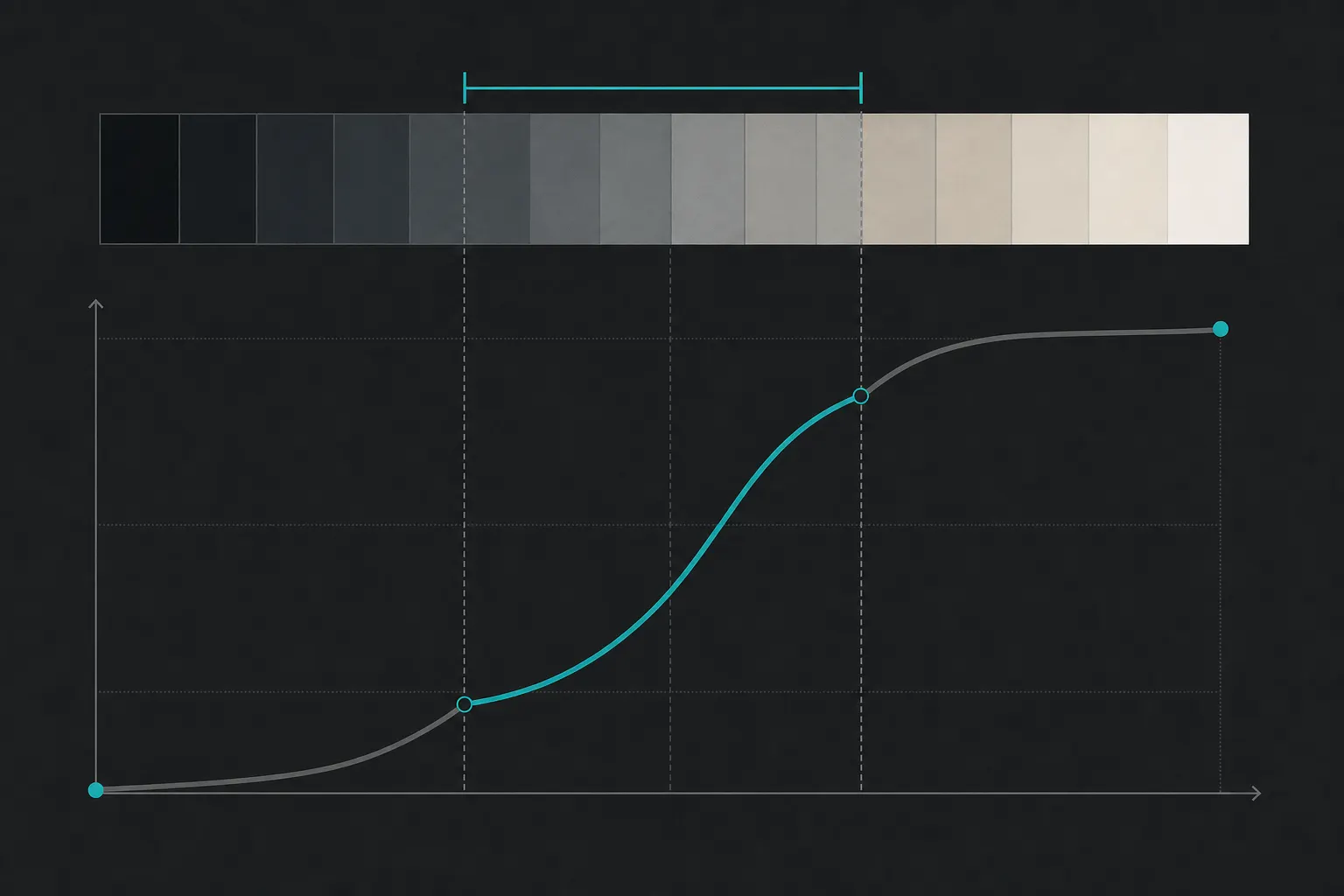
This is where midtones are made or muddied, because the middle of the tone curve is the most powerful and most abused control in the editor. One idea sits underneath every move: slope. The steeper the curve runs through a band of tones, the further apart it pushes them; the flatter it runs, the closer it crushes them together. A steep middle is a separated middle. A flat middle is the grey soup.
Which makes the S-curve the fundamental tool, and understanding its price is what makes it surgical. With the endpoints anchored, the curve's total span is fixed: steepening the middle does not create contrast from nothing, it redistributes it. The slope added through the midtones is taken from the shadow and highlight tails, which compress, not clip, to pay for it. That is precisely the right trade for most photographs: separation is spent where the subject lives and withdrawn from where only the punctuation sits. It is why "add a gentle S-curve" is the oldest advice in tonal editing, and why the extreme detail survives it as long as the compression stays gentle.
Set the endpoints deliberately, but know what a Levels move can and cannot do. Pulling the black and white points inward restores a true black and a clean white and stretches the whole range, but it stretches uniformly, every interval scaled by the same factor, and it clips whatever falls past the points to solid black or white. So it re-anchors a flat, faded capture; it cannot preferentially separate the subject's band, and pushed hard it shoves the detail-bearing tones near the ends up against the walls, collapsing exactly the transitions worth protecting. The disciplined order: set the anchor with the endpoints first, then shape the middle's slope independently, so the subject's separation survives the stretch instead of being spent by it.
For separation at the fine scale, two local-contrast tools divide the work, and they are not one tool at two strengths. Clarity is the midtone instrument by design: medium-radius local contrast, weighted toward the middle band (the muddy middle's direct antidote, the control that makes stone read as stone and a cheek turn). Texture works at a finer radius, on high-frequency surface detail (the weave of fabric, the grain of wood) enhancing the material without Clarity's heavier structural push. In measured doses they finish what the curve began. Pushed hard they become the muddy middle's most common replacement problem: the gritty, haloed, over-worked look where every midtone edge shouts "edited" (at which point a flat-midtone failure has been traded for an edit-discipline one, and a judge reads the swap in a second). Add midtone contrast; then stop.
The honesty clause: a curve can only separate tones that differ in the file. When the light was dead flat (frontal, overcast, on-camera), the subject arrives at one even brightness with no gradient across its form, and no steepness of curve manufactures the smooth tonal turn that real modelling light carves; forced, the tools hand back grit where roundness should be. That flatness is capture-limited. The fix is side light, next time, not a stronger slider tonight.
The ladder
- Beginner: global contrast only. One contrast slider for the whole frame, endpoints wherever they land, the subject's own tones never checked; subjects come out flat and grey, and the cause has no name yet.
- Competent: anchored but blunt. A clean black and white point, an S-curve by habit; the range is full and the obvious flatness is gone. But the midtone work is one global move, and subtly muddy subjects still slip through under a full-looking histogram.
- Strong (the working level of a serious editor): reads the middle band on purpose. Catches flat modelling at the scene and chases side light; can tell a full histogram from a separated one; shapes midtone contrast with a targeted curve and a measured touch of Clarity rather than one blunt global lever.
- Advanced: sculpts the middle locally and by intent. Builds the subject's dimensionality with directional light first, protects midtone separation while setting aggressive anchors, tunes local contrast zone by zone with masks and the curve, and knows when a flat middle is a mood the picture wants, not a fault, and leaves it alone.
Go shoot it
Start with the frame that sent you here, because the fix comes first and the drill comes after. The RAW whose critique named tonal hierarchy as your bottleneck is the one to work, and if its light has any direction in it, a lit plane and a shadow side you can watch turning across the subject, its middle can be shaped. Make one deliberate pass: set the black and white points, steepen the middle with an S-curve, add a measured touch of Clarity, and stop the instant the subject turns round rather than gritty. Upload it as a NEW VERSION and let the re-critique read it against the original: the same frame, its middle separated, measured from exactly where it started. But if that original is genuinely flat-lit (frontal, overcast, one even brightness with no gradient across the form) stop before fighting it: no curve carves separation the file never held, and forcing it trades roundness for grit. A flat original does not get curved into shape; it gets reshot into shape. That is the drill below, run as a real capture.
To learn to SEE the separation you are shaping, and to give a flat file the directional re-capture it needs, run the controlled shoot. Pick one subject with real surface and form (a face, a weathered door, a piece of fruit, a rock, a crumpled shirt) and one light source you can move around: a window you can walk the subject past, or a lamp you can carry. Freeze the framing, the exposure and the subject; let the only variable be the direction and hardness of the light on the form. Shoot it six ways: flat frontal (light from behind the camera), forty-five degrees to one side, ninety degrees hard side, that same ninety softened (a curtain over the window, the lamp bounced off a wall), backlit with the form falling into shadow, and one side-lit frame with a reflector or a bright wall filling the shadow side.
Import all six and convert them to black-and-white, because color hides what you are hunting. Look only at the subject's own tones. In the flat-frontal frame, watch the form collapse into one even grey: the muddy middle, manufactured on purpose so it can be recognized on sight forever after. In the side-lit frames, watch the gradient appear (lit plane, turning edge, shadow side) and feel how the hard ninety separates the middle hardest while the softened version rolls it gently. Rank the six by how three-dimensional the subject reads. The flat frame will lose, and that loss is the lesson: separation is written by the light before any curve exists. If you reshot a flat original, your strongest side-lit frame is the one to develop and send back.
Then read what the version compare says, because it points at the next lever whichever way it lands. A critique named tonal hierarchy as the bottleneck (that is why this page came up) and midtones is one lever inside it: the internal contrast of the band the subject is built from. If the separated middle was what the frame was missing, the re-critique should let go of tonal hierarchy, and the FinalFrame Score should move with the depth you built. And if tonal hierarchy holds its place, that is information, not indictment, and it is unusually decisive information: the subject now separates, so a brighter rival is still winning the frame's ranking. That rival is the eye-thief, and it is waiting one lesson over, in the tonal-hierarchy lesson. Go squint the frame down and hunt it.
Related lessons
See it on your own photo
The fastest way to understand the score is to read one on a frame you know well.
Critique a photo