Saturation vs Vibrance
Two intensity controls that do different jobs: saturation multiplies every hue equally; a vibrance-class lift raises muted hues more than vivid ones and shelters the skin band.
FinalFrame ocenia każde zdjęcie od 0 do 10: 6 to solidne zdjęcie, 8 to kadr godny portfolio, a 9 to poziom wystawowy. Jak działa ocenianie
Czym to naprawdę jest
Two controls sit side by side in nearly every editor, both promising more color, and the entire lesson is that they do not do the same job. Saturation is a master fader: it multiplies the intensity of every color in the frame by the same amount (the vivid and the pale alike) and it asks no questions. Vibrance is a discriminating lift, the name varies by editor, but a vibrance-class control ships in almost all of them: it raises the muted colors more than the already-vivid ones, eases off as any hue approaches full intensity, and in most implementations deliberately shelters the skin band. Same direction of travel, opposite manners. One turns up every voice in the room by the same amount, so the loudest voice distorts before the quietest becomes audible. The other walks the room and raises only the voices that are hard to hear, and keeps its hand off the faces.
Why the blunt one fails first: recorded color has a ceiling. Every hue in the file sits somewhere between grey and as-vivid-as-the-file-can-hold, and a uniform multiplier moves them all toward that ceiling together, so the hues that started nearest it arrive first. When a color clips, the gradations inside it flatten: a rose that held a dozen distinguishable reds becomes one red block, a lit window one amber slab. And skin fails before the ceiling is even close, for a different reason: the viewer's tolerance for skin error is the narrowest in the frame. Skin is the memory color the audience knows best, and a push does not have to clip it to betray it; it only has to leave the thin band of believable, which a global move does early, while the pale background it was meant to rescue has barely woken up.
Hold onto one more distinction, because it untangles half the confusion around weak color: saturation is a hue's purity, luminance is its brightness, and they are independent weights (the color lesson names them); this page puts them to work. A color can be pure and dark (a deep burgundy is heavily saturated and barely bright) so a color that reads weak is not automatically asking for chroma. Often it is asking for light, or for contrast against its neighbors. And the two axes are entangled inside the tools themselves: in most editors a contrast move raises saturation as a side effect, steepen the tones and the color intensifies with them, which is why the intensity verdict belongs at the end of an edit, after the tone work has already made its contribution, not at the beginning.
The borders of this page are clean. White balance is the floor: a cast contaminates every hue and reads as weak, muddy color, and correcting it restores more color than either slider ever will, which is why the baseline comes first. The color lesson, one level up, owns the whole verdict (accuracy, relationship, emphasis) and its emphasis layer decides WHERE intensity should be spent. The wheel's relationships live on the color-theory page; the mood layer on color-grading's. This page owns the intensity instruments themselves: what each one actually does, and which one the frame in front of you is asking for.
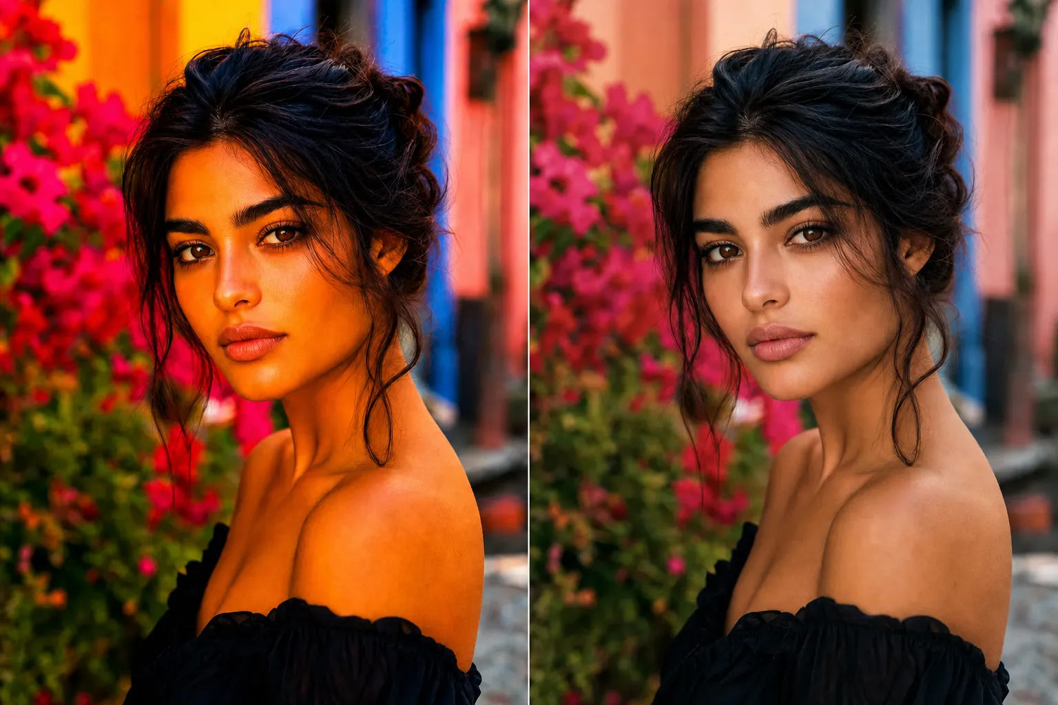
Wygenerowany przez AI
Dlaczego 6 to nie 8
A 6's color is loud; an 8's color is allocated. The 6 is usually the uniform push: saturation dragged up until the frame "popped" (on that screen, in that sitting, to eyes that had already adapted to every previous notch). The tells arrive in the order a judge finds them. Skin first: drifted toward orange, the one error no viewer needs training to catch. Then the memory colors around it: foliage gone toward neon, sky toward candy. Then the frame's strongest color, clipped into a flat block: look inside the red car, the market awning, the flower, and the detail that lived within the color is gone (one value where there used to be a dozen). And at 100%, in the shadows, the blotch: color forced onto the thinnest signal in the file. The move is nameable from across the room, and the moment processing becomes the first nameable thing in a frame, the verdict has already migrated: the edit-discipline lesson's territory, a slider that stopped serving and started performing.
An 8 spends intensity the way the color lesson's emphasis layer describes: where the picture lives, and quietly pulled back everywhere else. The muted hues are raised toward believable: the floor lifted, not the ceiling pushed. The strong hue keeps its interior gradation; the skin still tells the truth; nothing in the frame announces a multiplier. The judge's tell is two looks. First, inside the most saturated object: can you still count distinct tones within its color? Clipped color reads instantly, because flat blocks do not occur in the world. Second, the skin or the nearest memory color: does it still belong to reality? The distance between the scores is not more color and it is not less: it is distributed color. A 6 raised the volume of the room. An 8 decided which voices carry.
Przed naciśnięciem migawki
The screen question: which slider? It has a scene question underneath it: why is the color weak at all? Muted color at capture has four honest causes, and each points at a different fix, only some of which are sliders.
Glare: surfaces under hard top-light throw a specular sheen (white light reflected off the surface, recorded on top of the color beneath). Foliage, water, skin, paint all do it, which is why the same leaves photograph richer under light cloud than under noon sun: the diffuse light stops the wash-out. Haze and distance: the atmosphere lays a veil of unsaturated light over everything far away, and the muting grows with every step of depth (the far ridge is paler and greyer than the near one in the scene itself, before the camera adds anything). White balance: a cast pollutes every hue at once, and polluted color reads weak and muddy rather than tinted (the file looks like it needs saturation when it needs the truth). And exposure: over-bright color washes toward white, starved color sinks toward black, and a blown channel holds no hue at all (nothing any slider can bring back).
Then ask the question this page exists for, the one that decides everything downstream: was the color there? If your eye saw a red the file renders grey-pink (glare, veil, cast, or exposure took it), then a lift in post is restoration, and an honest one. If the scene itself was quiet (fog, dusk, a genuinely pastel world), the file is telling the truth, and a lift would be minting color that never existed. Half of saturation discipline is answered before the shutter, by simply noticing which kind of muted you are standing in.
W aparacie
Color intensity is bought cheapest at the scene, because the capture-side tools remove the causes instead of multiplying what survived them.
Kill the glare. A polarizer physically removes the reflected sheen and reveals the surface color underneath: sky deepens, foliage stops shining grey, water turns transparent to its own color. It is the one intensity move no slider replicates: once the sheen is recorded on top of the color, the file holds their sum, and no control separates them again. Timing does the same work free of charge: low sun, open shade, a bright overcast all deliver surfaces without the wash-out that hard top-light paints on.
Close the distance. The haze veil lives between you and the subject, and it thins with every step toward it; the color a long lens flattens through a kilometre of air, feet recover. Then protect the hue at exposure: the richest color lives just below the wash-out point, so hold the highlights (a blown channel holds no color to lift later, and even short of clipping, over-brightness pays for its glow in purity). Set white balance properly at capture, so the viewfinder shows the palette you are actually judging.
And when the scene is the quiet kind (the fog, the pastel dusk, the muted street) shoot it as what it is. A quiet palette is a palette; the frames that fail are rarely the ones that accepted it, and usually the ones that tried to overrule it at the desk.
W obróbce
Order first, because the intensity verdict moves if you take it early. White balance before anything: a corrected cast returns more believable color than any intensity move, and every slider decision after it is read through that baseline. Then the tone work, and expect it to change the color: contrast and saturation are entangled in most tools, so a frame that just received a real tonal edit has already gained intensity nobody asked for. Only then judge the color's level, and judge it cold if you can. Many frames need nothing more by this point.
When a lift is due, reach for the vibrance-class control first, the reflex the color lesson prescribes, and here is the full reasoning: it raises the muted floor, eases off the vivid ceiling, and shelters the skin, which means it can move further than saturation before anything in the frame starts to lie. Then, where the picture actually needs intensity (the subject's hue, the one color the frame is about) add saturation selectively: one hue band in the color editor, or a masked move on the region, never the global fader doing local work. That pairing, a modest vibrance floor plus targeted saturation where the image lives, is the disciplined version of what the +40 drag was reaching for.
The global saturation slider keeps two honest jobs, and knowing them is half this lesson. First, the small uniform move, most valuably in reverse: pulling the whole frame back a notch is predictable in a way no smart tool is, and the road to a deliberate desaturated look, or all the way to monochrome, runs through it. (In reverse the two controls part ways entirely: how a vibrance-class tool behaves when pulled negative varies by editor; run yours once on a frame with skin in it and learn its manners.) Second, the near-monochrome scene: one hue family, no skin (nothing vivid to clip, nothing for the smart slider's discrimination to work on). And know the smart slider's one blind spot, because it is the inverse of its virtue: most vibrance implementations shelter the warm band as skin protection, so in a scene BUILT of ambers and rusts (autumn, sand, firelight) vibrance barely lifts the very hues the scene is made of. There, a moderate saturation move, watched at the truth anchors, is the honest tool.
The truth anchors are where every intensity decision gets audited: skin, sky, foliage (the memory colors, the hues every viewer carries a reference for). An over-push reads false there first, and the audience catches the lie long before it can name the slider. Check them at every notch, on purpose, because your adapted eye will not volunteer the news.
Now the honesty clause. Neither slider creates color data: both multiply what the sensor recorded, and a multiplier is only as honest as the signal under it. Force saturation onto a weak color signal (the grey day, the distant haze, the deep shadows) and it amplifies the noise along with the hue: blotch and chroma speckle, worst in the shadows, where the signal was always thinnest. The scene that never held the color is capture-limited, and the honest fixes live outside both sliders: the polarizer, the closer position, the richer hour, or the reading that costs nothing and is most often correct, that the scene was a quiet one and the photograph should be allowed to stay one.
Drabina
- Beginner: one slider, one direction. Saturation up until it "pops," judged in the same sitting with adapted eyes; the orange skin and the neon foliage are discovered later, when someone else sees the file. The two controls are believed to be the same tool at different strengths.
- Competent: knows the two differ. Reaches for vibrance first, keeps skin believable, backs off the worst, but still lifts globally, treating muted as a defect to fix everywhere instead of asking where the picture wants intensity, and never asks why the color was weak at capture.
- Strong (the working level of a serious amateur): diagnoses before lifting. Asks which kind of muted this is (glare, haze, cast, exposure, or an honestly quiet scene) and fixes the cause first: white balance, then tone, then a vibrance floor with saturation spent selectively where the subject lives; audits skin, sky, and foliage at every notch, and checks the shadows at 100% before calling it done.
- Advanced: intensity as hierarchy, not level. Color intensity is allocated the way tonal weight is: spent where the eye should go, withheld everywhere else; the slider chosen per scene (vibrance for the mixed frame, honest saturation for the amber scene the smart tool refuses to touch) and the quiet scene recognized on sight and kept quiet, because restraint here is a color decision, not an absence of one.
Idź i zrób zdjęcie
No new frames: the capture is deliberately frozen, so intensity is the only variable left. Choose one RAW that contains all three test surfaces: a person or another memory color (sky or foliage will do), one already-vivid element, and a region of genuinely muted color. Correct it first (white balance set, tones placed) and pause there long enough to notice how much color the tone work alone already returned; that observation is the first result of the experiment. Then build three versions from that one corrected base. Version one: the fader (global saturation dragged up until the frame pops, in one sitting, no second-guessing); you are manufacturing the failure deliberately, because a failure you have built with your own hands is one you will recognize on sight for the rest of your editing life. Version two: the lift (the vibrance-class control only, raised until the overall impression roughly matches version one). Version three: the allocation (a modest vibrance floor, then saturation added only where the picture actually needs intensity, one hue band or one masked region, and pulled back everywhere else).
Walk away, and come back cold. Inspect all three at the same three stations, at 100%. Inside the strongest color: count the distinct tones still living within it (version one is where the counting stops). On the skin or memory color: which versions still tell the truth? In the shadows: find the blotch, and note which version fed it. Then shrink all three to thumbnails and notice which one still shouts at stamp size: loudness survives miniaturization; quality just reads as strong. Rank them cold, before loyalty votes.
Then close the loop. Upload version three as a new version of the image and let the re-critique read it against the original. There is no saturation category on the scorecard and no separate color sub-score: intensity is part of the color verdict, inside its emphasis layer, and a critique that named color as your ONE bottleneck is why you are on this page. So the prediction is concrete: if misallocated intensity was what the verdict was reading (the loud everything, the clipped subject, the doubtful skin), then the disciplined allocation should move it, and the FinalFrame Score has room to move with it. And if color is named again, that is information, not indictment, and here it reads two specific ways. Either the verdict was never about intensity: the palette itself is unchosen, a rival hue still fights the subject, and that work lives one page up, in the color lesson and on the color-theory page, where relationships are decided before levels are. Or the color was capture-muted all along (the grey day, the haze, the glare) and the tidiest allocation in the world was still asked to mint what the scene withheld; that frame is capture-limited, and its fix is the polarizer, the closer position, the richer hour, not a fourth version. Both readings cost you a plot on the next shoot, not a new eye. The score is not the reward: the moved bottleneck is.
Powiązane lekcje
Zobacz to na własnym zdjęciu
Najszybciej zrozumiesz wynik, czytając go na kadrze, który dobrze znasz.
Skrytykuj zdjęcie