White Balance
The color temperature setting that determines whether the image looks warm, cool, or neutral.
FinalFrame हर फ़ोटो को 0–10 पर स्कोर करता है: 6 सक्षम है, 8 पोर्टफ़ोलियो-योग्य है, और 9 प्रदर्शनी स्तर का है। स्कोरिंग कैसे काम करती है
यह असल में क्या है
White balance is the one color decision every other color decision leans on. A photograph has no absolute color: the file records what the light delivered, and the light always has a color of its own. White balance is the declaration of which recorded color counts as colorless: the neutral anchor that tells every hue in the frame what "no color" looks like, so the rest can be read as the colors they actually are. Set the anchor honestly and a white shirt is white, grey concrete is grey, skin is skin. Set it wrong and every color in the frame tells the same small lie.
The anchor rides on two axes set at right angles. The first is temperature: the blue-to-amber axis, measured in Kelvin. Light has a temperature the way a scene has a brightness: a candle burns near 1,900 K and throws deep amber; a household tungsten bulb sits around 2,700 K; midday sun lands near 5,500 K; open shade climbs past 7,000 K into blue. The second axis is quieter and forgotten far more often: tint, the green-to-magenta axis running perpendicular to temperature. Tint exists because some light (older fluorescent tubes, cheap LED, shade under leaves) is off-neutral in a direction no warming or cooling can ever touch; the green lies at right angles to everything the temperature slider can do. A white balance is right when both axes land: a surface that should be neutral renders neutral, and every hue built on top of it reads true.
But accurate is only half the craft. The deeper decision is whether this frame should be true or should lean, neutralized for truth, or shifted on purpose for mood: warmed past accurate because the memory of that afternoon was warm, cooled below neutral because the cold is the point. A chosen cast is a wholly different act from an unnoticed one. The first is authorship; the second is an accident wearing authorship's clothes, and a viewer can usually tell which they are looking at.
This is the foundation layer under the whole color story. The color lesson one level up asks whether the palette works; this page asks the prior question: whether the frame's idea of neutral can be trusted. A tint that survives a correct white balance is its own problem with its own lesson (color-cast), and a stylistic color treatment laid on top is another still (color-grading). Get the neutral right first; every later color move is measured from it.
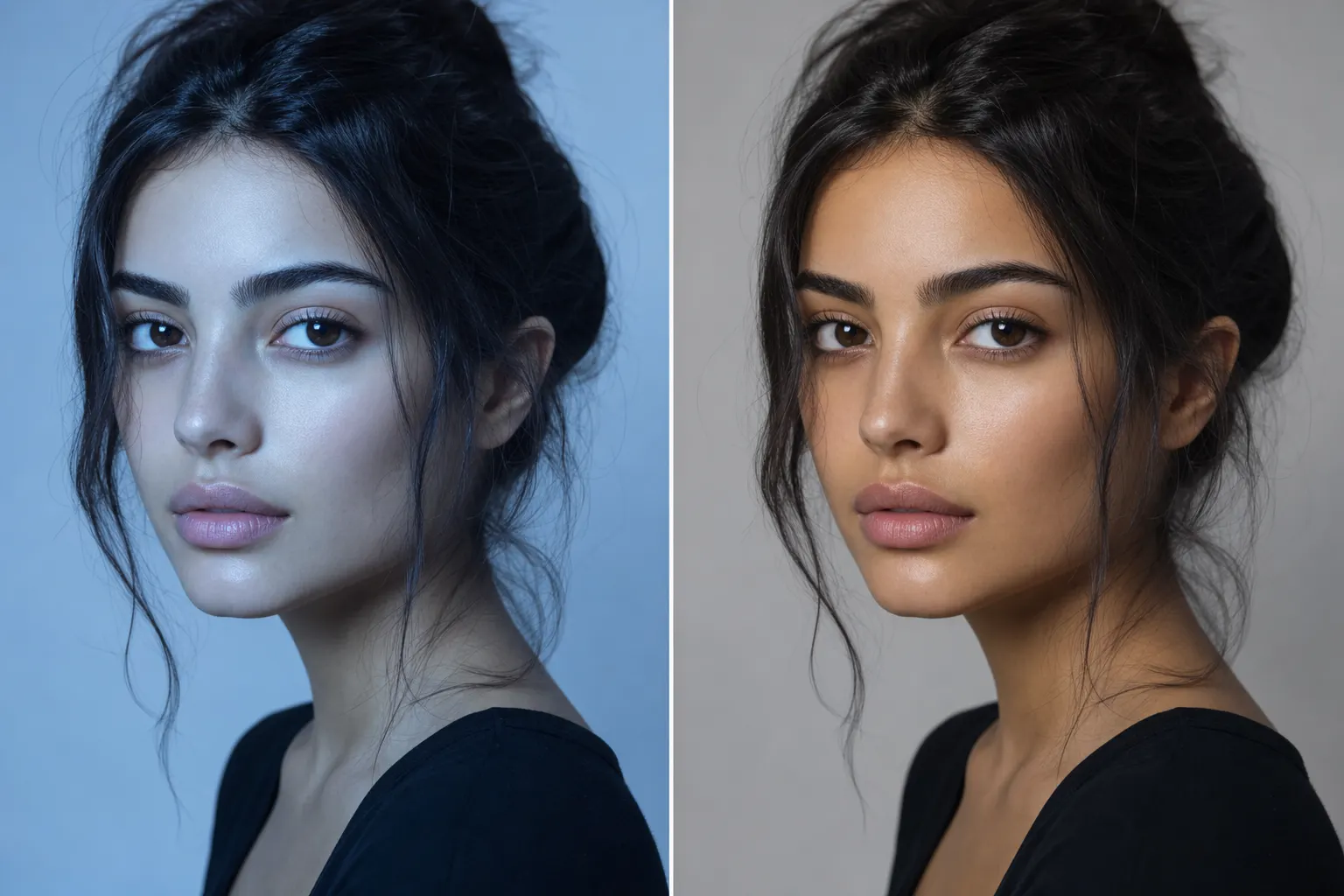
AI से बनाई गई
6 क्यों 8 नहीं
A 6 has a believable white balance; an 8 has a chosen one. On the 6, auto white balance got close (neutrals read roughly neutral, skin is plausibly skin, nothing shouts) but the setting is the camera's average, not a decision, and the average shows on one axis or the other: a faint drift toward green under mixed indoor light, or low-sun warmth quietly cooled back toward grey, the camera correcting away the very light that made the frame worth taking. Nothing is wrong enough to name, and nothing was decided. Un-chosen and slightly off is exactly how competent color reads: it gives a judge nothing to flag and nothing to remember.
An 8's neutral is a position held on purpose. Either a surface that should be neutral is neutral to the pixel (clean enough that every other hue in the frame can be trusted) or the frame leans warm or cool and the lean is legible as intent: consistent, proportionate, serving a mood you can point to. The tell is a single question: could the photographer state the decision aloud? "Warmed a touch for the late light; tint held dead neutral so the skin never drifts green." A 6 has no answer, because no one asked the question: the camera answered first. And the reason the anchor carries weight beyond itself: a trustworthy neutral is what lets every other color decision in the frame be believed. Once the viewer's eye finds one surface it knows is honest, the whole palette inherits the credibility. Take that surface away and even the deliberate colors read as maybe-accidents.
शटर से पहले
Read the color of the light before trusting the camera to read it for you. Daylight is not one color; it is a schedule. Dawn and dusk run deeply warm; noon sits near neutral; open shade goes blue because the subject is lit by blue skylight rather than the sun; overcast cools too, for its own reason: the direct beam is gone and the diffusing cloud layer itself becomes the source. Train the eye on the shift: step from sunlight into building shade and watch a white shirt turn faintly blue. It was blue all along; the eye had been cancelling it. Indoors, name the source before framing: tungsten is warmly orange, and older fluorescent or cheap LED throws green (the other axis, the one no amount of warming will reach).
Then hunt the case that breaks every automatic system: mixed light. A face lit by a warm lamp on one side and a cool window on the other is sitting in two white balances at once, and no single setting can be right for both. Seen now, the split costs a step: the subject moves fully into one light. Discovered later, at the desk, it costs surgery that cannot be entirely won. And know exactly when auto white balance lies: aim it at a scene dominated by one color (a green forest, a red-walled room, a sunset) and it reads the dominance as a cast to remove, hauling the whole frame toward grey and neutralizing the color the frame exists for. On those scenes the automatic guess is the thing to overrule.
कैमरे में
Shoot RAW, and white balance becomes a decision made twice (once now, once later) with no penalty for changing your mind. A RAW file records the sensor's channel data and carries white balance as metadata riding alongside it; the neutral is applied at render, never committed to the pixels, so re-balancing later is free. A JPEG is the opposite: its white balance is fixed into the pixel values at the instant of capture, and correcting it afterward stretches numbers that were already rounded off (push far and the color bruises). Shoot JPEG and the white balance must be right in the camera; shoot RAW and you keep the right of appeal.
The right of appeal is not a license for inattention. Set a deliberate white balance at capture anyway (matched to the light, or to the lean the frame is meant to have) because composition and exposure are judged against the preview, and the preview should show the picture you mean, not a grey average. There is a mechanical reason too: the in-camera histogram and clipping warnings are computed from the processed preview, so a wildly wrong setting can skew even the exposure read on a RAW shoot. For color-critical work (a product's exact hue, skin under difficult light, artwork that must match the original) photograph a grey card in the scene's light once, and it becomes the one-click neutral reference for every frame that follows. And when the light is genuinely mixed and the frame matters, fix it at the source: move the subject fully into one light, switch the second source off, or commit to the split on purpose. A neutral you set is always cleaner than a neutral you rescue.
एडिटिंग में
This is where white balance is most fully won, because on a RAW file it is nearly free to redo. Work the two axes in order. Temperature first, the blue-to-amber slider, then tint, green-to-magenta, to clean up what the temperature move leaves behind, most often the green that no warming or cooling touches. The fastest route to a true neutral is the eyedropper: click something in the scene that should be colorless (grey concrete, a plain shirt out of direct sun, a shadowed white wall) and the editor solves both axes at once to make that spot neutral. Prefer a light grey to a bright white: a clipped white reads neutral by definition and tells the sampler nothing. From a known neutral, then, taste (a nudge warmer for the mood, cooler for the cold) but always from the anchor, never from a guess.
One piece of the mechanics trips nearly everyone, so learn it once. The Kelvin scale runs opposite to the words: a high Kelvin number describes a cool, blue source (open shade, an overcast sky) and a low number a warm, orange one: candlelight, tungsten. But the editor's temperature slider corrects by mirror image: drag it up toward the high numbers and the picture gets warmer, not cooler, because the number declares what the light was and the software compensates for it. The number you dial is the temperature of the light; the shift you see is its cancellation. Once that clicks, the slider stops being fought and starts being steered.
The honesty clause is narrower here than almost anywhere in this curriculum, and that is the good news: on a RAW file, white balance is one of the most recoverable decisions in all of photography (the neutral genuinely was not committed at capture). But two walls are real. A JPEG's baked-in balance moves only so far before neutrals turn muddy and skin blotches; the stretch is happening on data that was already rounded off. And mixed light cannot be un-mixed by a global move: one temperature that neutralizes the lamp side of a face tips the window side bluer still, so the only true fix is to mask the two lights apart and balance each on its own (surgery that shows wherever the boundary between them is soft). A hard split baked into a JPEG, or entangled at every soft edge, is capture-limited: the fix lived at the scene (one light instead of two, a killed lamp, a subject moved) and no slider now buys it back. And whatever tint survives a correct white balance is a different problem with a different lesson: the residue belongs to color-cast, and the stylistic pass on top to color-grading. This page's job ends when the anchor is honest.
सीढ़ी
- Beginner: leaves the camera on auto white balance and trusts it; the shade-blue and the fluorescent-green go unseen, and color is edited without a neutral ever being set.
- Competent: shoots RAW, catches the obvious cast, and corrects temperature with the slider or the eyedropper until neutrals look believable; the tint axis goes unworked, and auto is still allowed to steal the golden light back toward grey.
- Strong (the tint axis is a late arrival: plenty of otherwise-fluent editors correct temperature for years before learning to see green): treats white balance as a decision: reads the light's color at capture, works both axes in post from a known neutral, and chooses on purpose whether the frame reads true or leans warm or cool.
- Advanced: commands the neutral as authorship: an exact reference when truth demands it, a deliberate shift when mood does, mixed light seen at the scene and solved locally when it must be, and the white point treated as the foundation from which every other color decision is measured.
जाइए और खींचिए
Do this one on the edit side, on the very frame that sent you here. Open the RAW whose critique named color as the bottleneck, not a new shoot; the recovery is the point, and a RAW neutral is free to redo. Make four versions from that single file, changing only the white balance: one, as-shot (the camera's guess, untouched); two, true neutral: the eyedropper on something in the frame that should be colorless, both axes solved; three, deliberately warmed past neutral, as if the mood wanted the afternoon back; four, deliberately cooled below it. Same crop, same exposure, same everything else. Only the anchor moves.
Line the four up together. The comparison is the lesson: one identical frame, and its mood swings this far on a single decision. Interrogate the neutral version hardest: with the temperature right, did a faint green or magenta survive, the tint axis quietly asking for its own move? Then pick the version that serves the picture, not the one that is most technically correct. Sometimes that is the true neutral. Sometimes it is the deliberate warm, and now it is deliberate.
Upload the chosen version as a new version of the image and re-critique it. Color is the diagnosis that brought you to this page, and a neutral that was decided rather than accepted is exactly what should retire it: watch for color to drop out of the verdict and the FinalFrame Score to move behind it. And if color is named again, that is information, not a dead end: it means the residual lives past the anchor you just set. Either a tint survives that no single white point can reach, which is precisely where the color-cast lesson picks up, or the anchor was never the real problem and the palette itself is, one level up in the color lesson. Both readings are worth the upload to know. The white point was never the whole color story: it is the ground the rest of it stands on, and this time it was placed on purpose.
संबंधित पाठ
इसे अपनी फ़ोटो पर देखें
स्कोर समझने का सबसे तेज़ तरीका है उसे किसी ऐसे फ़्रेम पर पढ़ना जिसे आप अच्छी तरह जानते हैं।
किसी फ़ोटो की समीक्षा कराएँ