建築
強い一枚を支える技術、そして6と8を分けるもの。
FinalFrame はすべての写真を0〜10で採点します。6 は堅実な一枚、8 はポートフォリオに値する一枚、9 は展示クラスです。 採点の仕組み
見る
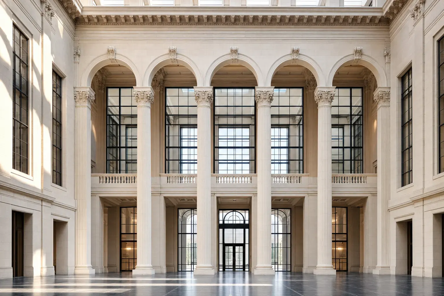
Architecture is the most plannable genre in photography: the building doesn't move (you do). That inverts the usual field problem. A street photographer waits for a moment; an architectural photographer schedules one. So the seeing starts before the visit: walk the site, note which facades face which way, and use a sun-position app to find the hour when raking sidelight crosses the elevation you care about. Light skimming along a wall drags a shadow out of every reveal, mullion, and course of brick: that is what turns a surface into a subject. The difference between flat and sculpted is often thirty minutes; the facade that says nothing at four o'clock can say everything at four-thirty. Returning is not failure to plan. Returning is the plan.
Then decide what the photograph is about, because a building is not one subject but several. Every building has a defining idea (a rhythm of windows, a geometry of intersecting volumes, a materiality of concrete or glass or timber) and a frame that tries to include all of them describes none. Pre-visualize the way an architect draws: is this an elevation (frontal, formal), a volume (corner, dimensional), or a detail?
And book blue hour. The twenty to forty minutes after sunset are architecture's golden hour: interior lights come up warm against a cool sky, the window-to-sky contrast drops into a range one frame can hold, and a building that stood mute all day starts describing itself from inside.
AI生成
撮る
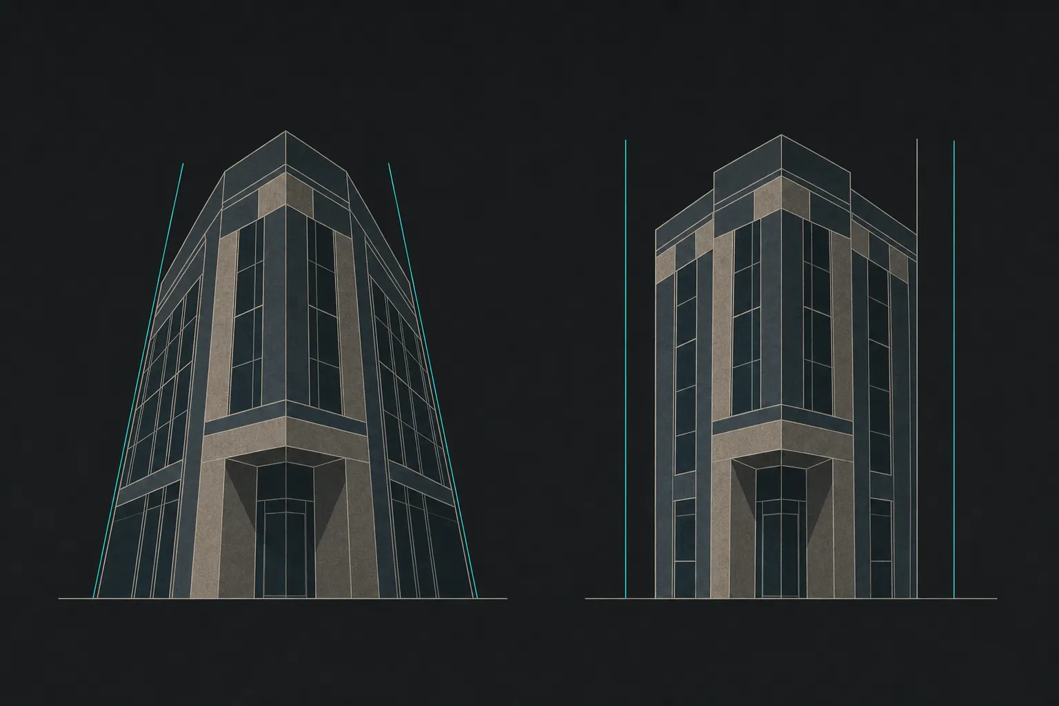
Verticals first. Tilt the camera up and the vertical lines converge, the building leans back, because the sensor is no longer parallel to the facade. That is projection geometry, not a lens flaw, and it has three honest answers: keep the camera level and accept foreground you will crop away; use a tilt-shift lens, whose shift movement keeps the body level and slides the frame up the facade; or shoot wider than the final frame and correct in post, leaving margin for the crop the correction takes.
Know when convergence is a fault and when it is a choice. In documentation and real-estate work, leaning verticals read as error, full stop. Standing between towers and shooting straight up, convergence is the picture, so commit to it completely rather than halfway. And know that full correction can overshoot into flatness: on an angled view, a one-point correction (verticals plumbed, the single vanishing point receding down the street left alone) preserves the depth. Save the two-point treatment for corner views, where both facades recede to their own vanishing points and the verticals still stand straight.
Interiors run on two disciplines. Keep the camera dead level: the smallest tilt makes the walls converge and the room feels wrong before a viewer can say why. And respect the dynamic range: the gap between a daylit window and the room it lights is extreme, so a single frame usually blows the glass or crushes the shadows (bracket and blend). Or use the trade's dusk trick: shoot interiors at dusk, not midday. The exterior dims until it matches the interior lighting, the windows fill with twilight instead of white, and the room and the view often land in one exposure.
Height is a separate decision from level, and interiors punish photographers who conflate them. Level governs tilt, whether the verticals stand, but height governs what every horizontal surface in the room does, and the discipline is chest height, between 1.2 and 1.5 meters. From there the camera sits just above the counters and tabletops, so they read as the thin, ordered planes they are: the kitchen counter becomes a line, the dining table a clean edge, the bed a level band, and the room keeps its architecture of stacked horizontals.
Raise the camera to standing eye level and every one of those surfaces wedges open: the lens looks down into them, tabletops foreshorten into slabs, near surfaces stack onto far ones, and a composed room degrades into an inventory of furniture tops. Drop much below chest height and the failure inverts: the undersides of tables enter the frame, seat backs loom, and the room reads like a child's view of it. The band between 1.2 and 1.5 meters is not a convention someone invented; it is roughly the midpoint of a standard-height room, and from the midpoint the floor and ceiling divide the frame honestly while the planes between them stay planes.
After dynamic range, the interior's second heartbreak arrives in post, and it is color. A lived-in room runs two or three light sources at once: tungsten lamps at their deep amber, daylight through the windows several thousand kelvin cooler, and increasingly an LED strip somewhere at a third temperature (often carrying a green or magenta bias no temperature slider addresses at all). A single white balance can serve only one master. Balance for the lamps and every window goes blue; balance for the daylight and the room drowns in orange; split the difference and everything is slightly, unfixably wrong. The orange-window, blue-room frame is not an editing failure: it is two lighting systems disagreeing inside one exposure, and no global slider has ever neutralized both.
The fix is at capture: commit the room to one temperature. Kill the practicals and let daylight own the space entirely, or keep the lamps lit and gel the windows toward tungsten, which is the film trade's answer and has been for decades. And note that the dusk trick above earns its keep a second time here: at dusk the two temperatures stop fighting and start cooperating, warm interior against cool twilight, the one hour when the split reads as intent rather than error. That is a choice too. Drifting into it at two in the afternoon is not.
Then patrol what the room reflects, and what it contains. Interiors are lined with mirrors that don't call themselves mirrors: the glazed cabinet front, the glossy floor, the framed print under glass, the switched-off television aimed at the middle of the room like a black eye. The photographer standing in their own frame, tripod and all, is the classic interior disqualification: invisible on the small screen, unmissable on the large one. The escape is geometric, because a reflection obeys one law: the angle in equals the angle out. Move the tripod, change the height, work from outside the reflected cone, and for the mirror that cannot be dodged, fire on a timer and step out of the room.
Finally, accept what every professional interior quietly admits: an interior is styled, not found. Cables tucked, cushions plumped and squared, chairs aligned to the table, the counter cleared to two or three deliberate objects, towels hung straight, and every object at a frame edge either included whole or excluded entirely, because a chopped chair arm at a border reads as carelessness the viewer feels before they can name it. Two minutes with your hands before the shutter beat an hour with the clone tool after it, and the clone tool loses anyway: a room cleaned in software never quite looks lived in, only tampered with.
Match the focal length to the subject instead of defaulting to wide. Wide angles establish spatial context: the building in its site. Around 50mm, at the distance it makes you stand, draws a facade closest to how the eye reads it, without the edge-stretch a close wide angle forces. And 70–200mm from across the street compresses repetition: windows, columns, balconies stacking into pure rhythm. Shoot the parts, too: the door handle, the stair curve, the shadow pattern a screen throws at noon. A building's character often lives at doorknob scale.
Shooting listings for a client? The real-estate guide (/learn/real-estate) is this page's companion, it assumes every discipline here and adds the delivery side: the showing test, flambient, the dusk hero, and the clock.
- Camera height
- chest height, 1.2–1.5 m: tabletops read as thin planes, not slabs
- Verticals
- keep level + crop · a tilt-shift's shift · or correct in post (leave crop margin)
- Correction
- 1-point on an angled view (keeps depth) · 2-point for corner views
- Focal length
- wide = site context · ~50 mm = eye-like · 70–200 mm = compressed rhythm
- Interiors
- dead level; bracket + blend the window gap, or shoot at dusk so it balances
- Mixed light
- commit the room to ONE temperature: no global WB neutralizes two sources
編集
Geometry before tone. Perspective correction re-projects and crops the frame, so plumb the verticals, or confirm the deliberate convergence, before any tonal or local work; a dodge placed before the keystone correction ends up somewhere else afterward. Then edit for planes and edges, because that is what architecture is made of: hold the sky down so the roofline reads, let the lit facade carry the brightest tones, keep shadow-side detail present but clearly subordinate. Small clutter (a sticker, a bin, one distant pedestrian) clones out cleanly; a street full of parked cars does not, and an edit that tries becomes the subject.
The honesty clause, and this genre earns a different one. Two of architecture's classic capture "faults" are substantially fixable in post, and pretending otherwise would be false rigor: converging verticals straighten convincingly in software (a tilt-shift in a slider, at the cost of some crop and edge-stretch) and a moderate window-to-interior gap blends cleanly from a bracket. Those are edits, not reshoots. But the genre's real ceiling does not move: flat midday light that never sculpted the facade is flat forever. No slider re-rakes light that wasn't there; no clarity or dehaze manufactures the shadow a reveal never cast. The wrong hour is a capture limit: a return trip, not an edit. The consolation is that the building will still be standing.
評価
The critique gives one lane-weighted FinalFrame Score and names ONE bottleneck, the single limit costing the frame the most, not a scorecard of sub-grades. Review your own frame the same way before you upload.
For architecture frames sitting at 6 or 7, the named bottleneck is usually one of three. Composition: a whole building recorded without deciding what about it mattered. Tonal-hierarchy: flat light making a flat image, every plane carrying the same weight. Or clutter: the cars and signage the frame tolerated because the building was the point. Uncorrected converging verticals ride along with all three: not steep enough to read as intent, not corrected enough to disappear (they read as an unmade decision). Above 8 the bottleneck migrates to micro-polish: a correction halo along the roofline, a faint color cast in the shadow side from mixed sources at blue hour, chromatic fringing on high-contrast mullions, an edge the crop should have sealed.
- Are the verticals plumb, or convergent on purpose, and could a stranger tell which?
- Does the light sculpt the facade or merely expose it?
- What did this frame choose to emphasize (rhythm, volume, material) and does everything in it serve that choice?
- What is at the edges: cars, signage, a pedestrian half-in?
6と8を分けるもの
The 6 is a competent document. Exposure right, building recognizable, verticals possibly even corrected. But the frame is an inventory: it proves the building exists, states its address, and stops. The eye reads the facade once, left to right, and is finished, because the photograph never decided what about the building deserved a frame. A 6 could illustrate the listing.
The 8 reveals the building's character. The light was chosen, not accepted: it rakes the elevation and the material switches on (brick becomes texture, glass becomes sky, concrete shows the grain of its formwork). The composition isolates the design intent (the one rhythm, the one junction of volumes, the one material conversation the architect cared about) and excludes everything else. The verticals are either clean or so steep the intent is unmistakable. Nothing at the edges argues with the subject. An 8 looks like the building understood.
And in this genre the gap is pure decision, more nakedly than anywhere else. The building granted both frames identical conditions: same facade, same vantage available, same hours in every day. The 6 was made when the photographer happened to be there; the 8 was made when the light was. The cruelest diagnostic an architecture frame can face: would the architect learn anything about their own building from it? A 6 shows the building. An 8 shows what the building is about.
So when the critique names the bottleneck, go back: this is the genre where the reshoot is cheapest, because the subject waits. Shoot the same building again for that one thing: the hour that rakes the facade, the emphasis the frame never chose, the edges swept clean. If the fix is real, the next critique names a different limit, and the FinalFrame Score has room to move. And if the same bottleneck is named again, that is information, not indictment: the building hasn't changed, so a repeated call isolates the variable exactly (the frame still needs a different hour or a different distance, and both are still on offer). No other genre runs that clean an experiment, and no other subject is this patient. The building will hold its pose for as long as it takes to learn its light.