Color theory
The color wheel as a working tool: how hues behave by their distance apart, and the named relationships (complementary, analogous, triadic, split-complementary).
FinalFrame ocenia każde zdjęcie od 0 do 10: 6 to solidne zdjęcie, 8 to kadr godny portfolio, a 9 to poziom wystawowy. Jak działa ocenianie
Czym to naprawdę jest
The color wheel is not an art-school poster; it is a map of how hues behave in each other's company. Lay the hues in a circle by kinship (red easing into orange into yellow, green into teal into blue, around and home again) and every pair of colors in the world acquires an address: neighbors, strangers across the circle, or something between. Distance on the wheel predicts behavior in the frame. That is the entire claim of color theory, and it is a practical one: a palette is a chord. Plot a photograph's hues on the map and they draw a shape (a straight line across the circle, a short arc of neighbors, a spatter with no geometry at all) and the shape tells you, faster than taste can, whether the frame holds a relationship or a bag of unrelated hues.
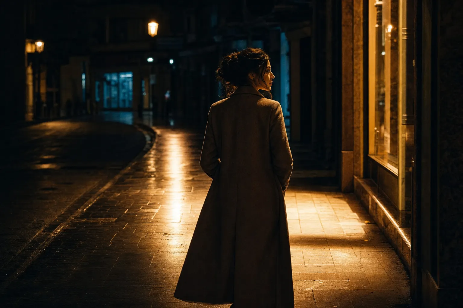
The named relationships are the working vocabulary, and each one is a photographic decision before it is a theory. Complementary, opposites across the wheel, is the high-tension chord: set two opposites side by side and each turns the volume up on the other, a fact of perception rather than preference (orange is more orange against blue than it will ever be against red). The world sells this pair constantly: a rust hull on sea-green water, one lit window in a dusk-blue street. Analogous, a short arc of neighbors, is the quiet chord: every hue a relative, the scene reading as one weather, which is what low warm light lays over a landscape without being asked. Triadic, three hues evenly spaced around the circle, holds energy in balance: three voices, no argument and no silence; rarer in nature, common wherever people paint things. And the under-taught workhorse: split-complementary (one hue plus the two flanks of its opposite). It keeps most of the opposition's energy while losing the head-on collision, and it matters to a photographer for a blunt reason: the world rarely offers a perfect opposite, and offers the flanks all day long. Even a single hue family, moved only by light and saturation, is a legitimate chord: one note, held.
One fold in the map outranks all the geometry: the wheel splits into a warm half and a cool half, and the two halves behave differently in space. Warm hues push toward the viewer; cool hues sit back. That makes temperature a depth tool and a weight tool, not a mood garnish: a warm subject stands forward off a cool ground, and a scrap of warmth carries more pull than its size, which is the visual-weight lesson's ledger arriving through color. The borders of this page are clean: white balance is the floor beneath everything here (the wheel only tells the truth about a frame whose neutrals are honest). The color lesson, one level up, owns the whole verdict: accuracy, relationship, emphasis, together. This page is the relationship layer as a working instrument; and when the chord gets chosen at the desk instead of the scene, the craft of applying it is the color-grading lesson's. What this page teaches is the map itself, because a photographer who can read distance on the wheel stops hoping palettes happen and starts building them.
Wygenerowany przez AI
Dlaczego 6 to nie 8
A 6's color is present and accurate; an 8's color is structured. The 6 holds every hue the scene happened to contain, all rendered at the same volume: believable, correct, and unchosen. Plot it on the wheel and you get the spatter: six or seven points scattered around the circle with no geometry between them, because no geometry was ever imposed. Nobody excluded anything. The frame did not choose its colors; it collected them: an inventory with accurate labels.
An 8 plots as a shape. Two points across the circle from each other, or three in a tight arc, a chord you could draw from memory after ten seconds of looking away: ochre and storm-blue; three greens and one copper roof. And the shape has a hierarchy inside it, which is the tell within the tell: one hue owns the field, the other answers in a small voice from a specific place. This is where the wheel's arithmetic gets interesting: an opposition at equal volume is not twice as strong, it is a fight, two colors shouting the same line until neither is heard. Give one hue most of the frame and its opposite a sliver, and the sliver wins attention it never paid for: amplified by its opposite, weighted by its warmth, loud beyond its acreage. So the judge asks two questions of a palette, in order. Does it draw a shape on the wheel (line, arc, triangle) or a spatter? And inside the shape, who leads? A 6 fails the first question. A frame that passes the first and fails the second, the right pair at war over the lead, is closer than it feels, and one proportion decision from the answer. The distance between the scores is not more color. It is fewer hues, in a nameable relationship, with one of them in charge.
Przed naciśnięciem migawki
Count the hue families first: before the subject, before the light, one sweep of the finder. One family? Two? Three? Past three unrelated families, an inventory is forming, and no relationship survives that crowd. The count is the fastest color diagnostic there is, and it costs one second.
Then find the chord the scene is offering, and name its address on the wheel out loud: are the two strongest hues opposites, neighbors, or a flank pair? The scene proposes; you dispose. A market street proposes twelve chords at once and the framing picks one; a foggy shoreline proposes a single quiet arc and the only decision is whether to accept it. Either way the relationship should be named before the shutter: a chord you cannot name is a chord you have not chosen, and the wheel is only a tool while the naming happens in advance.
Last, read the light itself as a hue, because the light is usually the biggest color in the frame and the root note of any chord built inside it. Low sun lays a warm arc over everything it touches: an analogous base, free of charge. Dusk and open shade lay a cool field, and against a cool field, every window, lamp, and lit face becomes a warm accent: a complementary structure you did not have to build, only frame. Flat grey light is the neutral case: no base note, every surface hue speaking at its own value, which makes it the honest test of whether the scene's objects hold a chord at all. The hours are a timetable of relationships; part of seeing is knowing which chord is on offer when you arrive.
W aparacie
A palette is chosen with your feet and the frame edge, long before any slider votes. Every hue in the rectangle is a point on your wheel-plot whether you invited it or not, so include on purpose and exclude on purpose. Take the two steps that put the one orange kayak against the open blue water; take the one step that drops the stray red sign behind the doorway, because that sign is the third point that turns your line into a spatter. The frame edge is a palette instrument. Most broken chords are not built wrong: they are one exclusion short.
Then set the proportion, because the wheel names the pair and proportion decides whether it sings. Give one hue the field: fill most of the frame with the dominant family (the water, the wall, the foliage, the shadow side of the street) and frame so the opposing hue enters small and placed, not as a rival half. When the accent is warm on a cool field it needs even less room than you think; warmth and opposition both amplify it. If the two hues keep splitting the frame evenly, change position until one of them concedes.
Temperature is the third tool, and it earns its keep on the days the others go quiet. When subject and ground sit at nearly the same brightness, a warm-against-cool split will separate them on hue alone: the flat-light rescue, and the same color channel the subject-separation lesson counts among its four. Depth obeys the same fold of the wheel: warmth placed at the subject's distance pulls the subject forward; a warm patch behind it is a rival with a head start, pulling the background toward the viewer over the subject's shoulder. Place the warmth where you want the eye and the depth, and time the shoot for the chord the hour is selling: the cool dusk that turns lamps into accents, the low warm light that hands you the arc.
W obróbce
Name the target relationship before touching anything, because grading toward a chord is craft and grading toward "better" is a preset hunt. The classic move, warm highlights over cool shadows, works precisely because it is a relationship move: one temperature opposition, run on the tonal axis, installing across light-and-shade the same structure the wheel describes across hues. The wheels-and-sliders mechanics of that move belong to the color-grading lesson; what belongs here is the instruction it executes. Decide the chord, then grade toward it and nothing else.
The finer work is tightening the shape. A near-chord (five greens scattered a few degrees apart, a blue field with one teal outlier) tightens honestly: rotate the strays a small way toward the family and the arc closes. The off-chord third point quiets the same way: pull the stray hue's saturation down, targeted, until the structure re-emerges from behind it. One map note while the hue wheel is open: the wheel in your editor is the digital wheel, and it disagrees slightly with the painter's (orange's true opposite there slides toward cyan, which is why the film convention pairs teal against orange rather than the painter's plain blue). The map you grade on is the one in the software; read oppositions off that wheel, not the poster. And respect the limit on rotation: skin, sky, and foliage are the hues every viewer carries a reference for, and a small rotation passes where a large one reads as a lie (the audience catches a wrong green long before it can say why).
Now the honesty clause. Post shifts and tightens hues that exist; it cannot mint a palette. A flat grey scene never held a chord: push saturation into it and the sliders find no hue to amplify, only noise to color, blotching worst in the shadows. And no slider performs an exclusion: the red sign that broke the chord is behind your subject because you stood where you stood, and beyond a small clone-out its removal lived at capture. When the relationship was never in the scene, the frame is capture-limited, and the honest routes are two: the same place at the hour whose light brings the chord with it, or monochrome, which is not surrender; declining the wheel entirely is still a move on it, and for some frames the strongest one available.
Drabina
- Beginner: takes the scene's hues as given. The palette is whatever was there; the wheel is a diagram from somewhere, not a tool. Frames hold seven hues at equal volume and nobody, including the photographer, could name them an hour later.
- Competent: avoids the collisions. The ugly clash gets noticed, the worst stray gets desaturated in post, saturation stays believable. The frames stop fighting themselves, but the relationships that do appear arrived by luck, and the plot is still a spatter more days than not.
- Strong (the working level of a serious amateur): builds one chord at capture. Names the relationship before the shutter, excludes the third point with a step, gives one hue the field and the opposite the accent, and uses warm-against-cool to separate and to deepen when tone has nothing to give.
- Advanced: runs the wheel as structure. Split and triadic chords found on purpose; a palette held across a body of work the way others hold a tonal key; discord admitted knowingly when the subject demands unease, and the judgment to read a scene that offers no chord and answer with one hue, or none.
Idź i zrób zdjęcie
No carried subject this time: the world supplies the colors and you supply the geometry. Take one location with more hues than you need (a street, a market, a harbor, a park edge) and bring back THREE frames, one relationship each, built by exclusion. Frame one: analogous (a frame in which every hue is a neighbor, one arc, one weather); position and frame until nothing off the arc survives at the borders. Frame two: complementary (one dominant field with its opposite entering small and placed); the proportion is the exercise, so if the two hues keep splitting the frame, keep moving until one concedes the field. Frame three: temperature separation (a warm subject on a cool ground, or the reverse, in light flat enough that hue is doing the separating alone). Three frames, three chords, and the only tools allowed are feet, frame edge, and timing.
The rubric is the wheel-plot. For each frame, sketch the wheel (a circle on paper is enough) and mark every hue family the frame actually contains, borders included. Frame one should plot as a short arc, frame two as a line across the circle, frame three as one point in each half. Any frame that plots as a spatter has an uninvited point in it, find it in the image, and notice where it entered: almost always at a border or over a shoulder, one exclusion short of the chord you meant. Naming the intruder yourself, on paper, before any critique does, is the skill this assignment exists to build.
Then close the loop. Re-critique the strongest frame: the one whose plot came out cleanest. A critique that names color as the ONE bottleneck is reading the whole verdict (accuracy, relationship, emphasis) and this page owns the middle layer; a frame built as a deliberate chord is exactly what should move that finding. If the structure is real, the next critique should name a different bottleneck, and the FinalFrame Score has room to move with it. And if color is named again, that is information, not indictment, and on this page it reads two specific ways. Either a third hue broke the chord: re-plot the frame and walk the borders, because the uninvited point is usually sitting at an edge where your eye, full of the relationship you intended, never went. Or the pair is right and the proportion wrong, two opposites at equal volume are an argument, not a structure, and the fix is not a new palette but a demotion: give one hue the field and the other the last word. Both failures cost a step or a slider next time, not a new eye. The wheel already told you what to look for: the score is not the reward; the moved bottleneck is.
Powiązane lekcje
Zobacz to na własnym zdjęciu
Najszybciej zrozumiesz wynik, czytając go na kadrze, który dobrze znasz.
Skrytykuj zdjęcie