Color Grading
Intentional color shifts applied in post-processing to set mood or style.
FinalFrame はすべての写真を0〜10で採点します。6 は堅実な一枚、8 はポートフォリオに値する一枚、9 は展示クラスです。 採点の仕組み
本当のところ
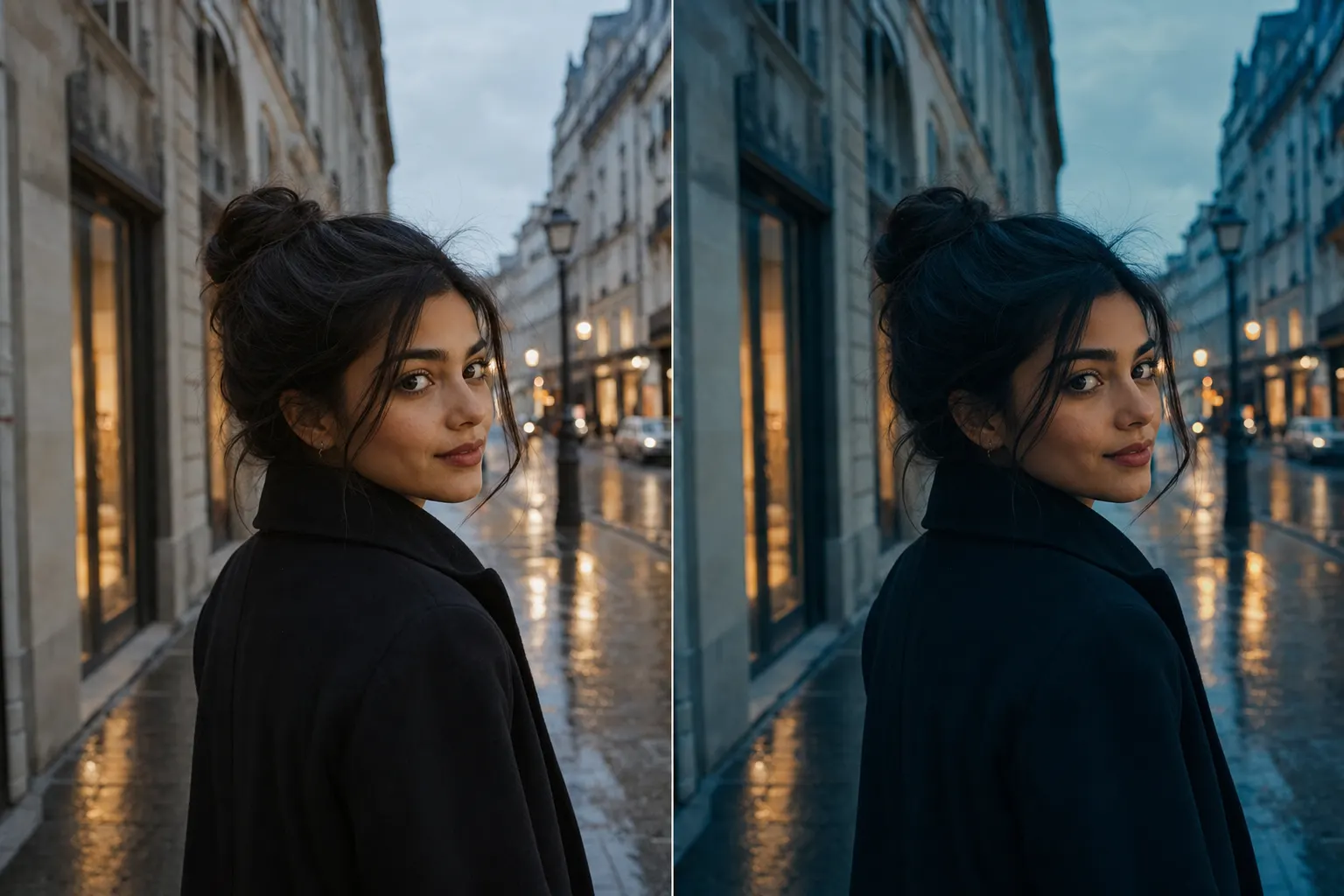
Color grading is the color decision that begins where correct ends. Everything before it is repair: white balance declares which recorded color counts as neutral, the cast hunt kills whatever tint survived that declaration, and when the repairs are done the frame finally tells the truth about its colors. Truth is not the same as meaning. A corrected file is accurate, believable, and mute: the palette left exactly where the scene dropped it, saying nothing in particular. Grading is the authorship laid on top of that honesty: a palette and a mood chosen for this photograph, so the color stops merely being right and starts doing work. Correction answers to the scene; a grade answers to your intent.
Draw the boundary hard, because every failure in this lesson lives on one side of it. Split-toning, teal-and-orange, an HSL move that quiets one hue so another leads, a look held consistent across a set: that is grading. The eyedropper, the tint slider, the mask that lifts a green bounce off a cheek: that is correction, with its own lessons one door down (white-balance and color-cast). And one level up sits the color lesson, the whole story of a frame's palette: accuracy, harmony, and emphasis together; this page is the palette-and-mood layer alone, the part built on top of a file that no longer lies.
The craft also answers to a second parent, and the second one is sterner. Edit discipline's law (the viewer should feel the edit and never see it) bites harder here than anywhere else in the pipeline, because a grade is the easiest edit in photography to perform instead of serve. So this is two abilities held at once: the eye to choose a palette that means something, and the restraint to make a stranger feel the mood without ever catching the wheels that built it.
AI生成
6と8を分けるもの
A 6's color is corrected but unauthored, and it gets there by two opposite roads. The first is the ungraded file: neutrals clean, nothing casting, the palette exactly as the scene handed it over (accurate, believable, forgettable, the mood still sitting on the table). The second is the borrowed grade: a preset or a LUT laid over the frame wholesale (teal-orange on everything, a moody film emulation reached by reflex), a look nameable from across the room precisely because it came from a menu and not from this picture. Opposite roads, same destination: the color was never chosen FOR the frame.
An 8's grade comes out of the content. You can read the mood it is reaching for and watch every move serve it: a palette drawn from the subject's own hues, a split-tone that deepens an atmosphere the light already had, a rival color quieted until the subject's hue leads, and all of it held down to the level where a judge feels the mood and cannot locate the grade. The tell is one question from the judging chair: can I name the preset? On a 6 the answer arrives in a glance. On an 8 there is no preset to name, because the grade was cut to fit one photograph and fits nothing else. Keep the proportion honest, though: a grade is never most of what lifts a frame (the idea, the light, and the moment outrank it) but chosen color that stays invisible is a real part of the distance, because it is one of the few places a viewer can feel intent without being able to point at it.
シャッターを切る前に
Grading is a post tool, so its seeing runs in two places, and both start from the same refusal: do not grade a file you have not corrected. Every grading move is read against the base beneath it, so a surviving cast or a wrong neutral becomes the foundation the entire palette is measured from: mood shaped on top of an error, a structure built on sand. Correct until the neutrals are neutral and the skin is believable; that is the price of admission to the wheels.
At capture, see the gradeable frame. Shoot RAW, so the grade travels as reversible instructions instead of baked pixels. Get white balance close, so correction stays a formality. And read whether the scene's own light can carry the mood you have in mind: a warm-lit subject against a cool surround is asking to be graded; flat, even, neutral light will fight any palette imposed on it, and the fight always shows.
At the screen, name the mood in one word before touching anything: warm nostalgia, cold isolation, muted document. A grade with no destination wanders into a preset. Then find the two hues that decide everything: the subject's own hue, and the rival (the off-palette patch bidding against it). Last, defeat your own eye, because it is the least trustworthy instrument at the desk, the adaptation trap edit discipline warns about: a few minutes inside a grade and vision normalizes the shift, the overcooked version starts to read as correct, and it ships. The counter is mechanical, not heroic: toggle the grade against the CORRECTED base, not the raw file, so you are judging what the grade itself contributes, stripped of the correction it sits on.
撮影時に
You cannot grade color the file never recorded, so the capture's whole job is to hand the grade a clean, rich base. RAW keeps the entire color pipeline live as metadata rather than pixels that can never fully be taken back; a cast baked into a JPEG turns every later grade into damage control. Then protect the color at both ends of the tonal range, because both ends are where grades go to feed: a blown highlight holds no hue to tint (there is nothing in it but white) and a starved shadow cooled later hands the tint chroma noise to amplify instead of color to shape. The exposure lesson owns the mechanics; the grading consequence is blunt: starved captures grade badly.
Then choose light and content that give the mood something real to work with. Golden hour hands over warm highlights for free; blue hour lays down a cool base that turns every warm light in the frame into an accent, and the grade that follows the light already in the frame is the one that never looks applied. When a person is your subject, the cheapest palette control in photography is what they wear and what stands behind them: a grade that separates warm skin from a cool surround is a whisper when the cool surround was placed at capture, and a fight when it was not.
編集で
This is where the craft lives, and its first rule is order: correct, then grade. Neutral set, casts killed, tones placed: a grade built on an uncorrected file only deepens the error underneath it, and every move in this section assumes the base is honest.
Build from the biggest decision down. First the palette, taken from the content: name the dominant hue and one accent, then choose the relationship between them. Analogous hues, neighbors on the wheel, harmonize and calm. Complementaries (opposites, blue against orange) oppose with energy and make a subject leap off its surround. The famous complementary is teal-and-orange, and it earns its paragraph because it is at once the most useful structure in grading and the most abused. It is a convention with an optical reason, not a fashion: skin lives in the warm orange region of the hue wheel, and teal sits close enough to orange's true opposite that the opposition still fires (push the shadows and the surround toward teal while skin stays orange, and a face separates from its background on pure complementary contrast, the subject's own hue taking the lead). That reason is also exactly why the borrowed version fails: lay teal-orange over a frame with no warm subject (a cool cityscape, a green forest) and the structure has nothing to oppose; the grade fights the content instead of serving it, and the preset names itself in a glance.
Split-toning is the next lever down: tint the shadows and the highlights separately. The classic move, cool shadows under warm highlights, reads as cinematic for two honest reasons: it runs the same skin-complement contrast on the tonal axis, and it exaggerates a real pattern of light (the warm key against the cool fill, a tungsten practical warming a face while skylight or an HMI cools the room). Keep it a whisper. The moment a viewer can see the teal shadows AS teal, the tone has crossed from mood into effect.
Then refine with HSL: hue, saturation, luminance, one color band at a time. This is where a restrained palette actually gets built: desaturate the rival hue until it stops competing and the subject's hue leads; nudge a frame's scattered hues toward one family so the palette reads as chosen rather than inherited. HSL is a scalpel. The global saturation slider is a hammer, and saturation is where grading does its most common damage, because over-saturation does not merely look loud, it clips a channel, and a clipped channel has no gradation left inside it: the subtle transitions that made a color read as real collapse into one flat block. Skin goes first: a face pushed past belief becomes a single orange mass. Reach for vibrance before saturation (it lifts the muted hues and spares the already-rich) and hold the whole grade under edit discipline's one law: the viewer feels the mood and never catches the wheels. A grade nameable from across the room has stopped serving the picture and become it.
The honesty clause, in grading's own terms. A grade shifts hues that exist; it cannot correct, and it cannot mint. Grade over a cast and the error compounds: the fix there was correction, not a warmer highlight. Force saturation onto weak color signal and it turns to blotch and chroma noise, worst in the shadows. And a mood the light and the content never offered cannot be installed from a menu: no wheel manufactures a warm subject that was never lit. When the color story asks for what the capture never recorded, the frame is capture-limited, and the honest fix is the next shoot (different light, a different hour, a surround chosen on purpose), not a harder push now. Hold the other exit open too: when the color story was already whole at correction, the most disciplined grade is nearly none, or a black-and-white conversion, which is a color decision too, and for some pictures the strongest one available. Grading shapes the color the light delivered. It has never once invented it.
上達の階段
- Beginner: grades by menu. Correction optional, then one look laid over everything: the same preset on every frame, judged on the same screen in the same sitting. The grade fits the filter, not the photograph.
- Competent: grades by convention. Hand-built but global: a cool-shadows/warm-highlights split applied evenly, saturation nudged, the worst skin damage caught, and teal-orange still reached by reflex, without asking whether this picture wants it.
- Strong: grades from the content (a late rung: plenty of technically clean editors grade by preset for years and never make it here). Reads the mood and the frame's own hues, builds a restrained palette with HSL and a whisper of split-tone, quiets the rival hue so the subject leads, and stops the moment the grade starts to announce itself.
- Advanced: grades as authorship. A palette that can carry across a body of work and still bend to each frame; complementary structure used the way others use light against dark; skin protected without exception; and the judgment to leave a frame nearly ungraded, or take it to monochrome, when its color story was complete at correction.
撮ってみよう
No new frames: the capture stays frozen so color is the only variable. Take one corrected-but-flat RAW; the strongest candidate is the image whose critique sent you here. Correct it first if it is not already (neutral white balance, casts killed, tones placed) because a grade on an uncorrected file decorates a mistake. Then build three versions from that one clean base.
Version one is the overcook, and it is deliberate: slam a maximum grade onto the frame regardless of what it holds (full teal-orange, saturation pushed until the skin crushes into a solid block and the look announces itself from across the room). You are manufacturing the preset tell with your own hands, because a failure you have built once is a failure you will recognize on sight for the rest of your editing life. Version two is the purpose grade, from zero: name the mood in one word, draw the palette from the subject's own hues (analogous for calm, complementary for tension) lay a whisper of split-tone under it, desaturate the rival with HSL until the subject leads, and stop the instant the grade stops serving the picture. Version three is the control: the corrected base itself, untouched.
Walk away (the longer the better) and come back cold. Toggle each version against the corrected base, not the raw file, so you are judging the grade's contribution alone. Then run the name-the-colors test: look away for ten seconds and say each frame's palette out loud. The overcook will name itself and its preset. The purpose grade should name a mood. The control should read honest and quiet. Rank the three on first reaction, before loyalty has time to vote.
Then close the loop where an editing lesson's loop belongs. Upload the purpose grade as a new version and let the re-critique read it against the original. A critique named color as this frame's one bottleneck (that is why you are here) and a grade built from the content is exactly the authored color a critique reaches for. So the prediction is concrete, and it is allowed to fail: if a palette with a point of view was what the frame lacked, the fresh critique should move its attention somewhere new, and the FinalFrame Score has room to rise with it (most visibly on the Artistic sub-score).
And if color holds its place as the bottleneck, that is a diagnosis, not a defeat, and it reads two ways. The grade may be real but too timid (present in the file, too quiet to register) and the next pass simply commits harder. Or the frame's color was complete at correction, and what read as a missing grade was the picture asking to stay neutral, or to go to black and white: the strongest color decision some photographs ever get to make. One last calibration: if your own cold eye ranked the overcook first, distrust the ranking, not the lesson (a fresh screen rewards the loudest file, which is the exact reflex edit discipline exists to catch). Keep the overcook and the purpose grade side by side afterward. They are your calibration pair, and the next time a grade begins to feel finished, the honest question is which of the two it has started to resemble.