Color
Whether the image's colors serve its mood and feel intentional.
FinalFrame her fotoğrafı 0–10 arası puanlar: 6 sağlam, 8 portföye değer, 9 sergi düzeyindedir. Puanlama nasıl çalışır
Aslında ne olduğu
Color in a photograph is a relationship, not a property. No hue is good or bad on its own: the same rust-orange is a gift against slate-blue and a casualty among seven competing brights. A color means only what its neighbors let it mean, and the color wheel is simply the map of those meanings: analogous hues, neighbors on the wheel, agree quietly and read as one temperature of feeling; complementary hues, opposites across the wheel, collide with energy, each making the other appear more intense; a triadic set, three hues spaced evenly around the wheel, balances without either the hush or the fight. None of these is a rule about beauty. They are names for kinds of relationship, and every frame contains one, chosen or not.
What the score reads is that word: chosen. Not accuracy, not vividness: intent. A frame full of correct, believable, unchosen color is exactly that: correct. Chosen is a different thing, and it is visible. One genre flips this hierarchy: in product work, color is a contract with a buyer (accuracy IS the intent, and a checker-verified neutral outranks any palette).
Work it in three layers. Accuracy is the foundation: white balance is the truth baseline (the setting under which a neutral is neutral, so every hue in the frame testifies honestly about itself). Shifting that baseline deliberately is a color decision; failing to notice it drifted means the frame made one for you. (The baseline's mechanics, and the cast that betrays a broken one, have their own lessons; this one assumes the floor and builds the storeys.) Relationship is the palette: how many hue families the frame holds and how they sit on the wheel. Emphasis is where saturation lives, and here is the distinction that untangles most color trouble: saturation is a hue's purity, luminance is its brightness, and they are two separate weights on the viewer's eye. The brightest patch bids for the first look, and so, independently, does the most saturated one: the tonal-hierarchy lesson's eye-thief has a color twin, and it wears a red jacket. Underneath both weights runs temperature: warm hues push toward the viewer and read as energy; cool hues sit back and read as calm. A palette decision is never merely decorative: color carries compositional weight and emotional register in the same stroke.
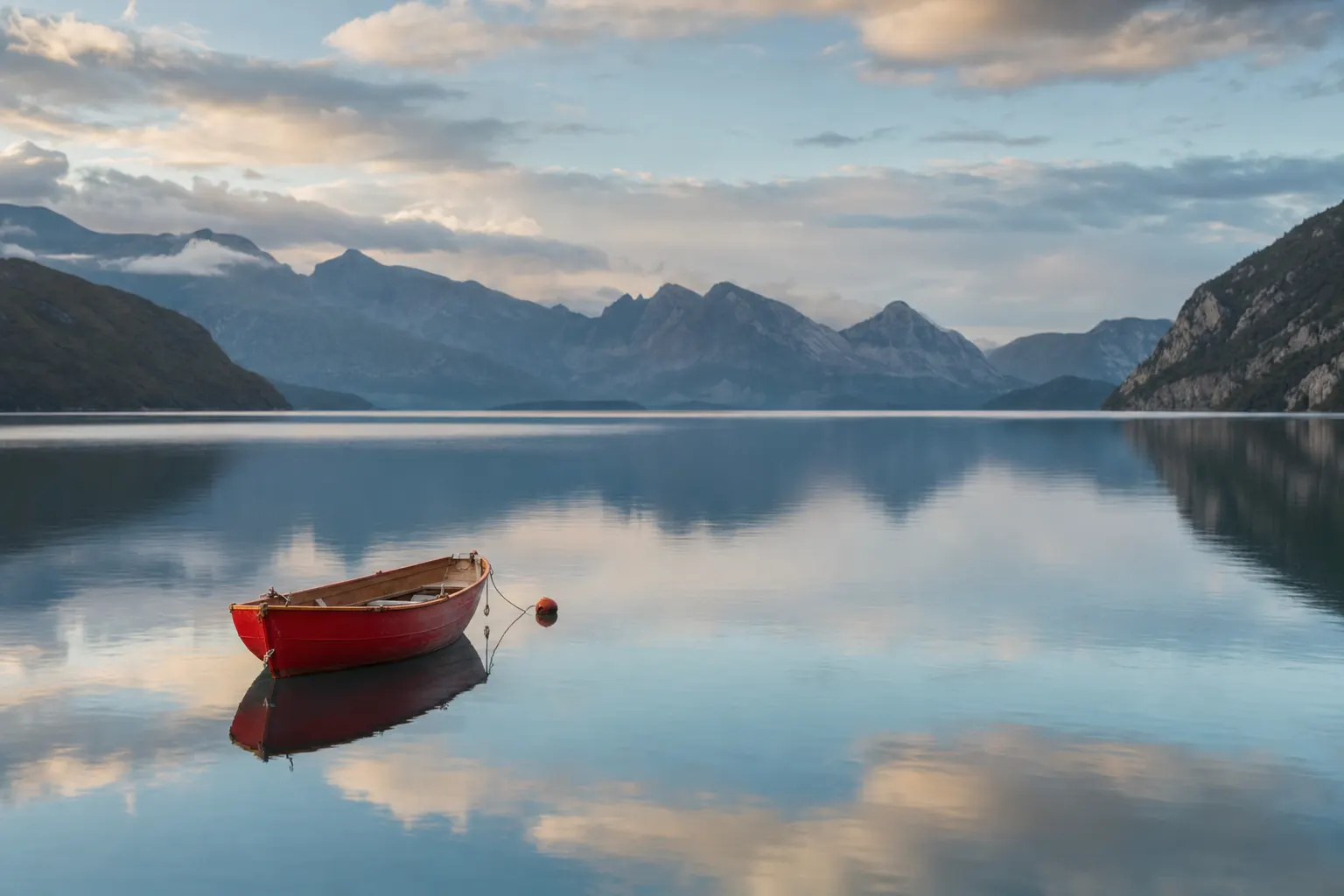
Yapay zeka üretimi
6 neden 8 değil
A 6 has correct color; an 8 has a palette. The 6's white balance is believable, nothing casts, skin looks like skin, saturation is healthy, and the frame contains whatever colors the scene happened to hold, every one of them rendered at the same loudness. Nobody chose them; the camera reported them. It is the chromatic version of the meter's opinion the exposure lesson warns about: technically defensible, with no author in it. Ten hues at equal volume is not richness: it is nobody in charge.
An 8 has a palette you could paint from memory: a dominant hue family, one deliberate accent, saturation spent where the picture lives and quietly pulled back everywhere else. The judge's tell: look away for ten seconds and name the image's colors. An 8 answers in a phrase ("rust and slate-blue, one red figure") because the palette was a decision, and decisions are memorable. A 6 answers with silence, because there was nothing to remember; the colors passed through the camera without ever passing through a mind. That nameability, color as authorship rather than transcription, is the whole distance between the two scores.
Deklanşörden önce
Three habits. All free, all before the shutter.
Name the palette out loud. Dominant family first, then the accent ("green field, one yellow coat") before you raise the camera. If you cannot, the palette has not been chosen yet, and the camera will not choose it for you.
Hunt the color thief. The small, saturated, off-palette patch (the red jacket in the far corner, the traffic cone, the neon sign) will out-shout your subject no matter what the tones are doing, because saturation pulls the eye on its own channel. It is the exact chromatic twin of the tonal eye-thief, and it hides in plain sight at capture, because your attention supplies the palette your frame does not have.
Read the light's color, not just its direction. Shade is blue. Low sun is a wash of analogous warmth. Overcast deepens color: the diffuse light stops surface glare from washing hues out, which is why foliage photographs richer under cloud than under noon sun. And mixed sources split a frame into two palettes at once: a warm lamp against cool window light divides a room down an invisible seam, and a face standing in both is standing in a problem. Seeing the split at capture is cheap; discovering it in the edit is not.
Kamerada
You choose a palette with your feet and the clock, long before any slider gets a vote. Position edits hues in and out of the frame: one step drops the red car behind the hedge; a lower angle trades cluttered ground for a single clean field of sky or grass. Timing selects the light's own palette: golden hour hands you analogous warmth for free; blue hour lays down a cool base that turns every artificial light into a warm accent: orange against blue, the classic complementary pair, delivered by physics on schedule. Overcast is the saturation noon cannot give you. One exception: underwater the clock stops voting (water strips red within the first several meters regardless of hour, so at depth a palette is bought with proximity, a strobe's restored spectrum, and a white balance set where the subject swims, never with a better time of day). And when there is a person in the frame, the cheapest palette control in existence is what they wear.
Shoot RAW and white balance stays a deferred decision (it travels as metadata, not baked pixels) but set it properly at capture anyway, because you compose differently when the viewfinder shows the palette you intend. And treat genuinely mixed light as the capture problem it is: no single white-balance setting can neutralize two differently-colored sources at once, so move the subject fully into one light, kill one source, or commit to the split as a deliberate two-palette frame. Half-committing is the cast nobody chose.
Düzenlemede
White balance comes first (before any tonal move, before any grade) because every color decision you make afterward is read through it. Then edit the palette from the biggest relationship down. Tame the thief: drop the stray hue's saturation until it stops shouting, targeted in the color editor, never with the global slider. Unify: nudge the frame's five scattered greens toward one family. Grade last, as the mood layer on top: warm highlights against cool shadows works precisely because it is a relationship move, one temperature opposition where there was drift, and a little of it is enough. The grade's full craft is its own lesson; what belongs here is the order (truth, then relationships, then mood) because a grade laid over an uncorrected baseline is a mood built on a lie.
Saturation discipline: reach for the gentler control most editors offer, the vibrance-class adjustment that lifts muted hues more than already-vivid ones and shields skin, before the blunt global one. And respect the memory colors: skin, sky, and foliage are the hues every viewer carries a reference for, and an audience detects a lie in them long before it can name one. Push skin past believable and the whole edit reads false, however disciplined the rest of it is.
Now the honesty clause. Saturation amplifies hues that exist; it does not create color data. A flat grey day cannot be saturated into a palette (the push onto a weak color signal turns to blotch and chroma noise, worst in the shadows) and badly mixed light cannot be un-mixed without masking every boundary between the two sources, which is surgery that shows. When the palette never existed in the scene, the frame is capture-limited, and the honest fixes live outside the saturation sliders: a black-and-white conversion (often the strongest color decision available); for concept-driven work, a palette built rather than found: a split-tone assigns hue by luminance instead of amplifying weak chroma, a design decision, not a rescue; or the same scene at an hour when the light brings a palette with it. One exception: a frame already committed to black and white has not left this lesson (its color work moves to the channel mixer, where each recorded hue is assigned a brightness rather than a name, and the palette is judged as tonal placement, not as anything a paint-chip test could read).
Merdiven
- Beginner: corrects. The cast comes out, saturation goes up globally, and the edit stops when nothing looks wrong. Color treated as a problem to remove, not a decision to make.
- Competent: protects. Skin stays believable, the thief gets caught in review, and vibrance and saturation are understood as different tools. Nothing lies, and nothing leads yet, either.
- Strong (a late rung: palette thinking arrives long after exposure discipline): chooses at capture. Shoots timed for the light's color, hues positioned in and out of the frame with feet, saturation spent where the subject lives.
- Advanced: authors. Palettes that hold across a body of work, warm-against-cool used as a structural force the way others use light-against-dark, and the judgment to know when the strongest color decision is monochrome.
Hadi, çek
Take one small, strongly-colored subject you can carry (a jacket, a mug, a child's toy) and find even, unchanging light: open shade or solid overcast. Stop down enough that depth of field is doing no separation work; color must do all of it. Then shoot FOUR frames, changing only the ground's hue relationship to the subject: (1) matched (a ground from the subject's own color family); (2) analogous: a neighboring family, quiet harmony; (3) complementary: the opposing family, maximum chromatic tension; (4) rival: any ground containing a second saturated, off-palette patch: the thief, deliberately admitted. Same subject, same soft light, same aperture. You will roam a little to find four grounds, so hold the light as steady as the location allows and let the ground's hue be the one deliberate variable.
The rubric is the paint-chip test: for each frame, look away for ten seconds and name its colors. The complementary frame should name itself. The matched frame will read either as a deliberate near-monochrome or as nothing at all, and which of those it is, is exactly the intent question this lesson keeps asking. The rival frame will teach you where your eye actually went, versus where you sent it. You met color once before, in the subject-separation lesson, as one isolation channel among four; here you are judging the relationship itself: does the pair sing, sit quietly, or fight?
Then close the loop. Re-critique the frame the paint-chip test crowned (usually the complementary one) and read the summary first: you built this frame around one hue relationship, and a palette that was genuinely chosen is exactly what a critique's opening read reaches for. A critique named color as your ONE bottleneck, which is why you are reading this; the shoot is the experiment that tests whether the diagnosis still holds. If the palette you built is real, the next critique should name a different bottleneck, and the FinalFrame Score has room to move with it. And if color is named again, that is information, not indictment, either the palette is real but quieter than one frame can prove (tone-on-tone is a legitimate palette, and a critique may read restraint before it reads intent), or the rival frame was the honest self-portrait: your eye went where the thief sent it, not where you sent it. Both are worth the frames to know: matched hues were never the failure; unchosen ones were. The score is not the reward: the moved bottleneck is.